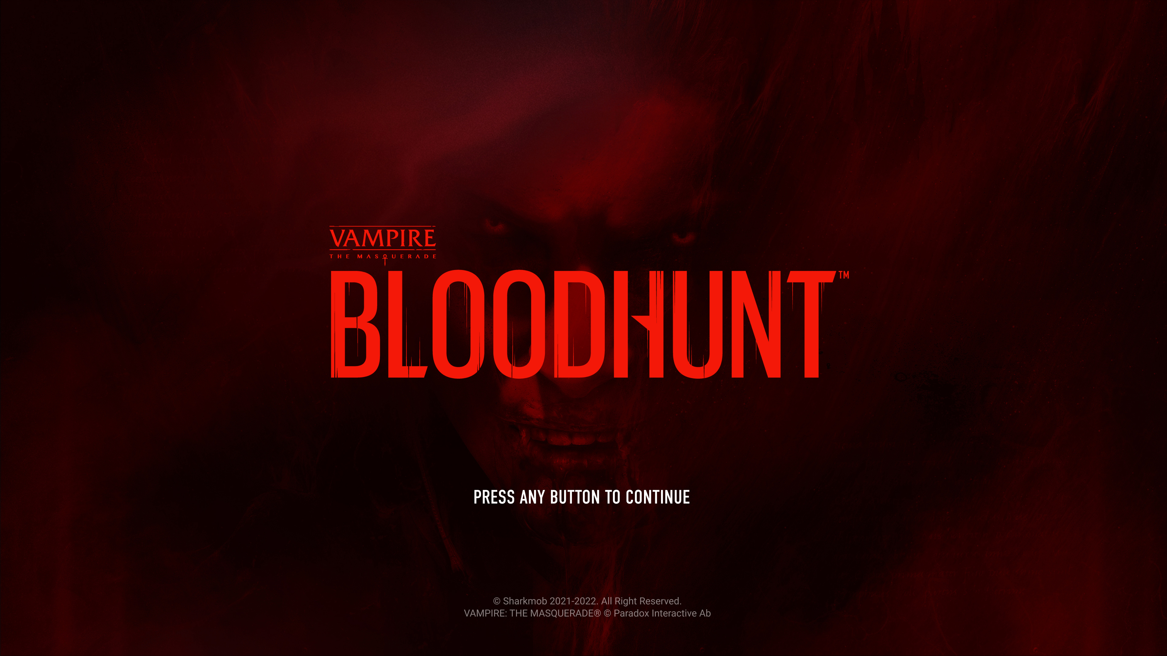
BLOODHUNT ™ - VAMPIRE THE MASQUARADE ®
⚬ Video Game
⚬ Visual identity / UI / Motion
\\ VIEW PROJECT
BLOODHUNT ™
BLOODHUNT
This game is a modern Battle Royal based on the world famous universe of Vampire The Masquarade ®.
A child's dream becoming reality, as I could be part of the creation of a video game.
For this AAA title, I have been setting the UI visual language and art direction together with the game art director, building the user experience and I helped implementing interfaces I designed in Unreal. I aslo spent time creating a design system and guidelines, for an easier management and consistency of the UI, as it was meant to be a game as a service.
During this journey, I got to learn Unreal and did integrate a few features and worked a bit with VFX for the UI within the engine.
As a personal challenge & motivation, I ambitioned to design - as much as possible - a "free from boxes" game UI, as I have the intimate conviction that interfaces in games could benefits from moving away from framing ("boxing") every UI elements. A bit like the transformation web went through along the years and in which, I feel, video games interfaces are stuck into.
I also believe it helped us blending the UI even better to the game visual language for a more seamless experience.
Of course, this while keeping in mind a console first design approach and prioritising accessibility to meet the standards.
This game is a modern Battle Royal based on the world famous universe of Vampire The Masquarade ®.
I helped Sharkmob designing the visual language, experience and UI, along with building a design system and guidelines.
As a personal mission, challenge & motivation, I aim to design - as much as it is possible - a free from "boxes" game UI, as I believe that interfaces in games could benefits from moving away from framing ("boxing") every componenents. A bit like the transformation web went through along the years and in which I feel video game's UI are stuck into.
COMPLETED•Aug. 2021 - Jan. 2023
ROLES•Senior UI / UX Designer - AD
PLATFORMS•PC/PS5
CONTEXT•SHARKMOB x TENCENT
COMPLETED • Aug. 2021 - Sept. 2022
ROLES • Senior UI & UX designer - AD
PLATFORMS • PC & Consoles
CONTEXT • Sharkmob x Tencent
For starters
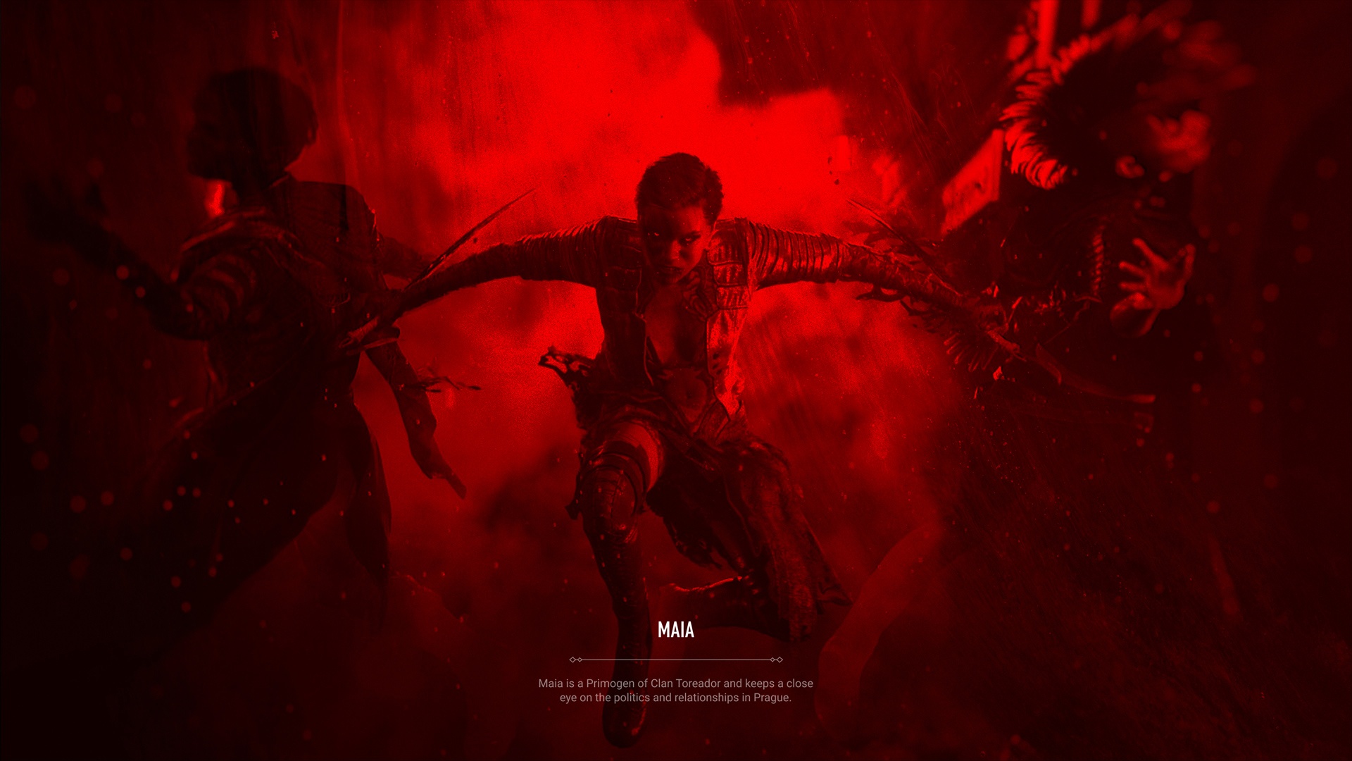
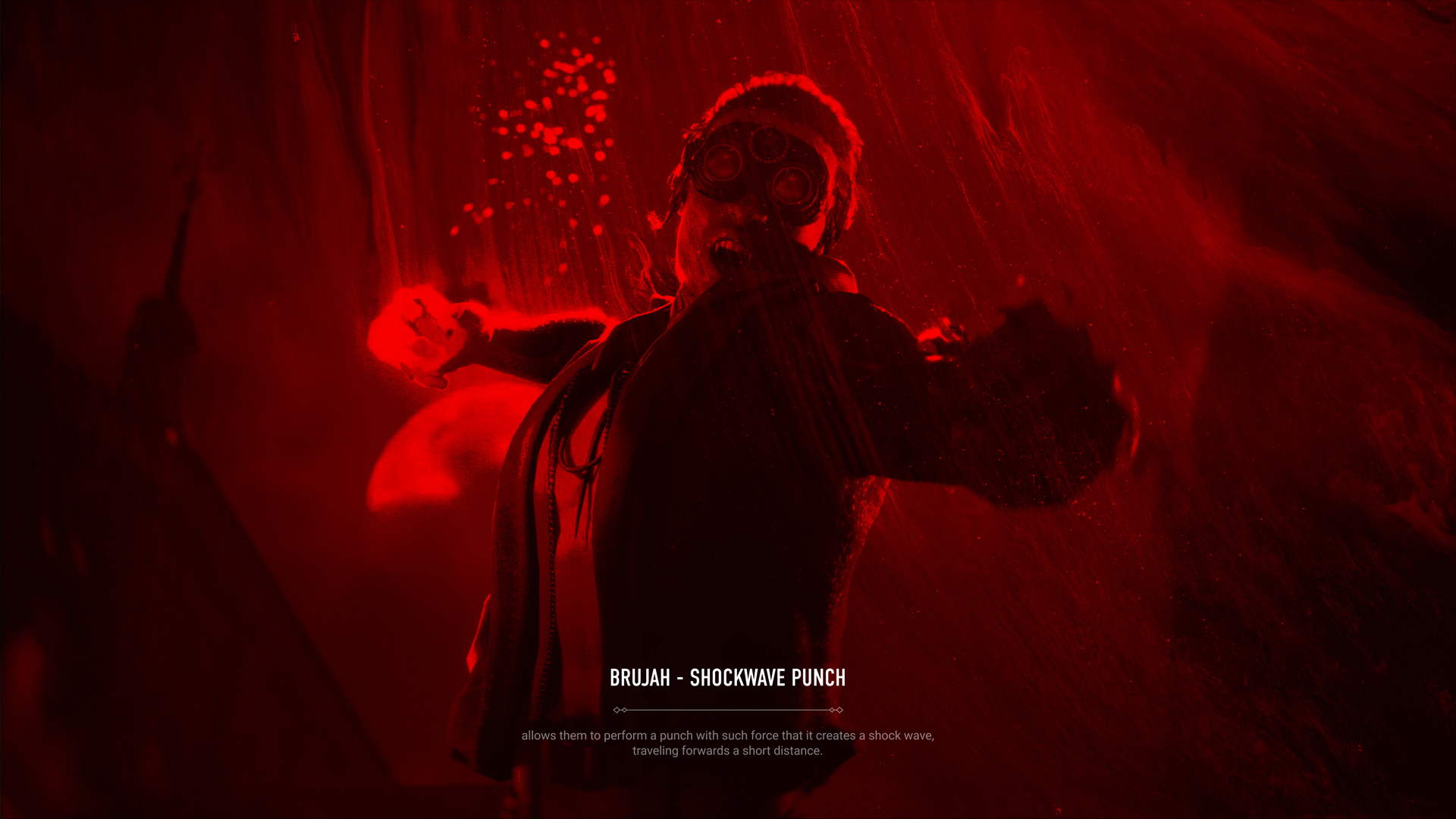
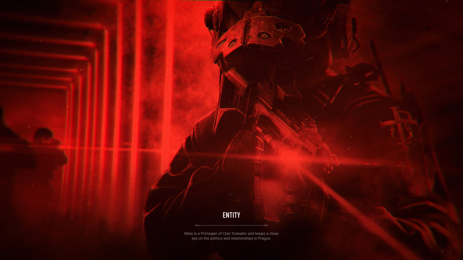
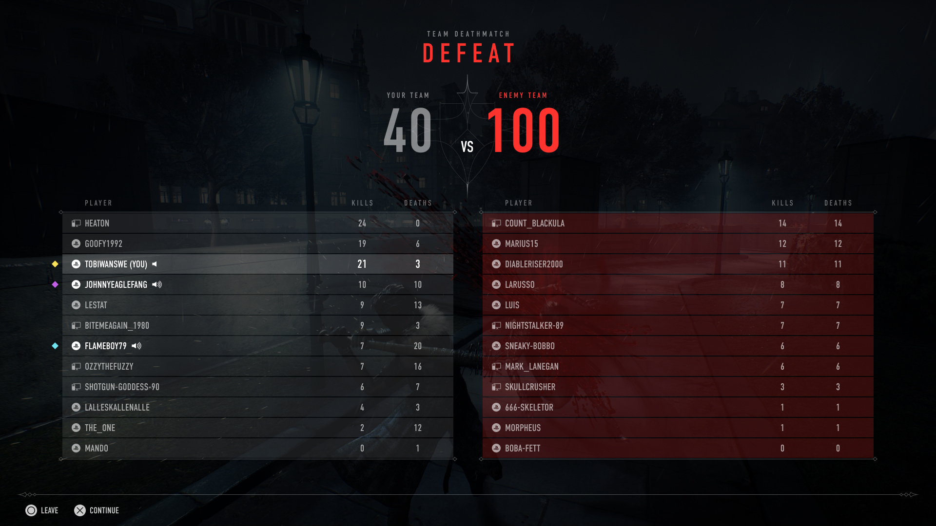
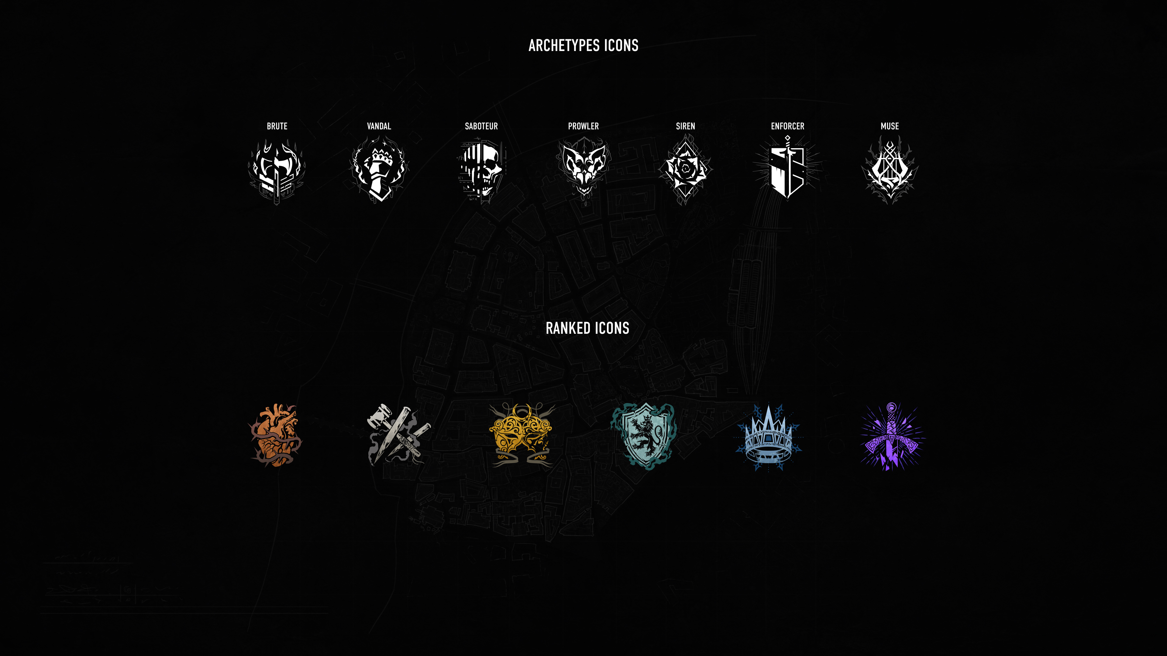
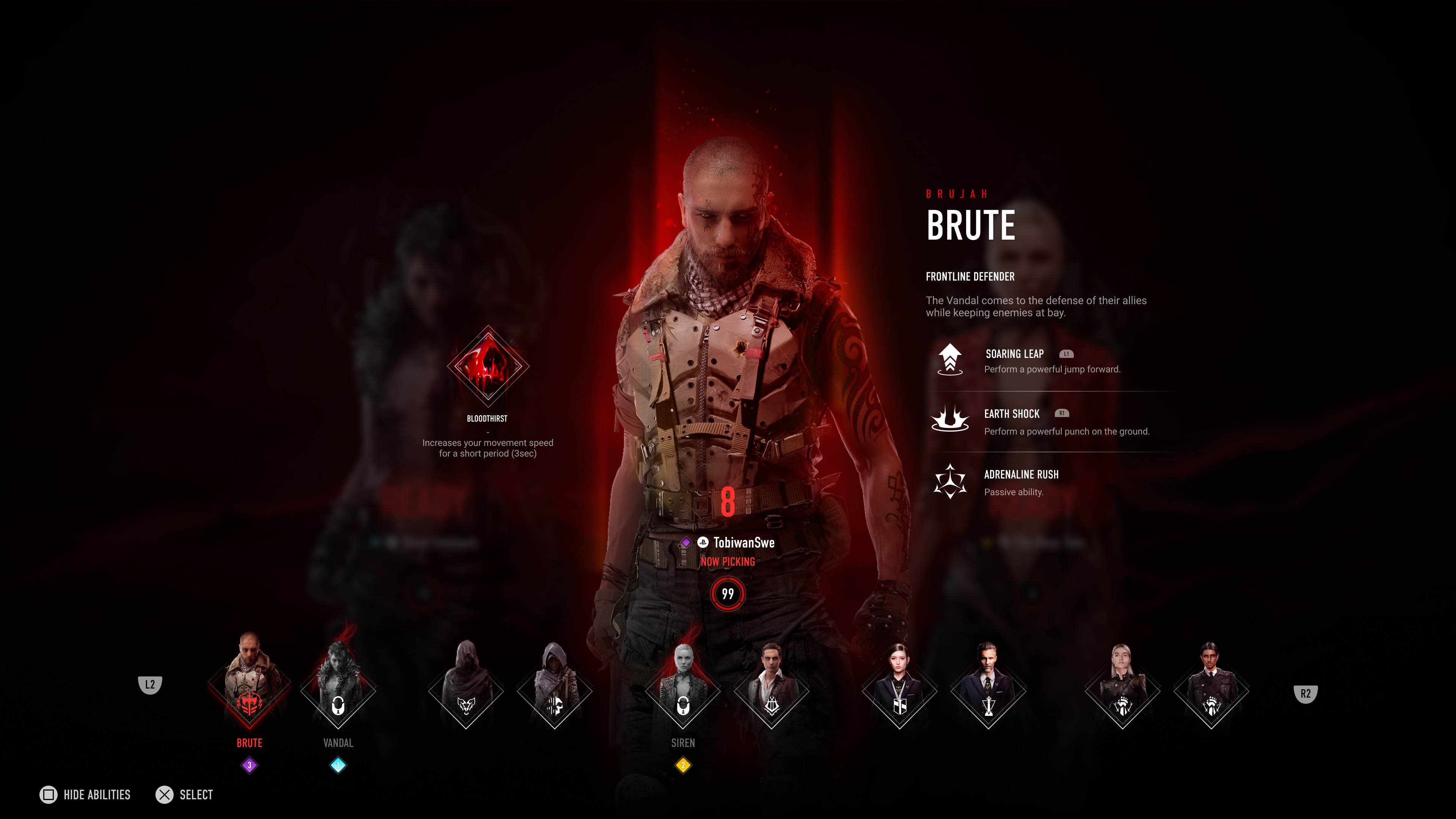
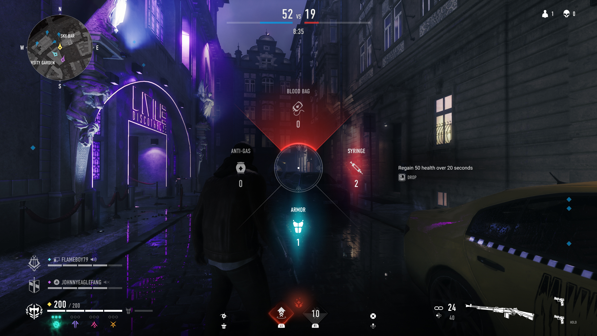
The game is based in Prague where different factions / clans of Vampires are trying to seize power to rule over the other clans. Each clans have various archetypes (playable character) with their own abilities.
We based our UI on 2 design principles:
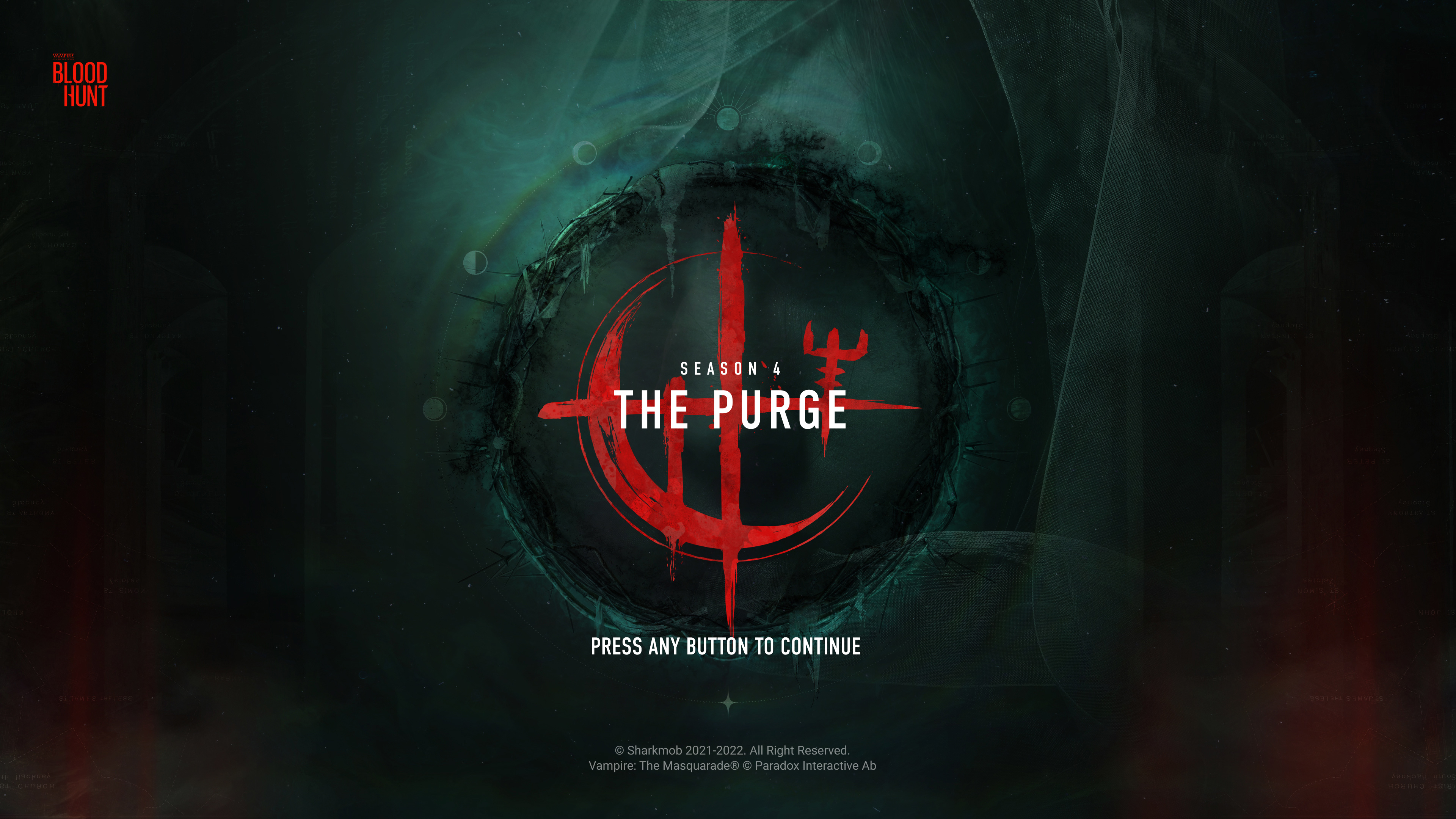
• Blood (red), mature & HBO like for the visual language.
• Console first when it comes to accessibility and gameplay.
Everything needed to be accessible with a gamepad but also with mouse and keyboard, which is a very interesting challenge, in my opinion, for any designer. During this journey, I've learned a lot regarding accessibility standards to create an intuitive UI, accessible to most players both visually and from an usability perspective.
The Art Direction
Shortly after I joined the project, my first question was: who are we designing for? Who are the players who will play this game? So not only we could propose an interface that blends in with the game's visual identity but also speaks to our player base.
Then, together with the team, we started to define our target audience based on data we collected and our own assumptions.
Thanks to a bunch of players interviews, we decided to pivot towards a more mature audience than previously anticipated. Thus, we pushed a notch higher the visual language to reflect a more mature type of content.
Below lies a short selection of concept arts I produced and post produced, to nail down the mood for the Bloodhunt™ UI.
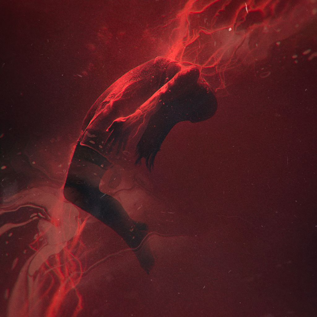
Bloodveins & fluids quickly appeared as main components, creating the missing link between all layers of the game. From Art to UI and motion.
(In the end we even decided to use those as loading screens as people really liked them).
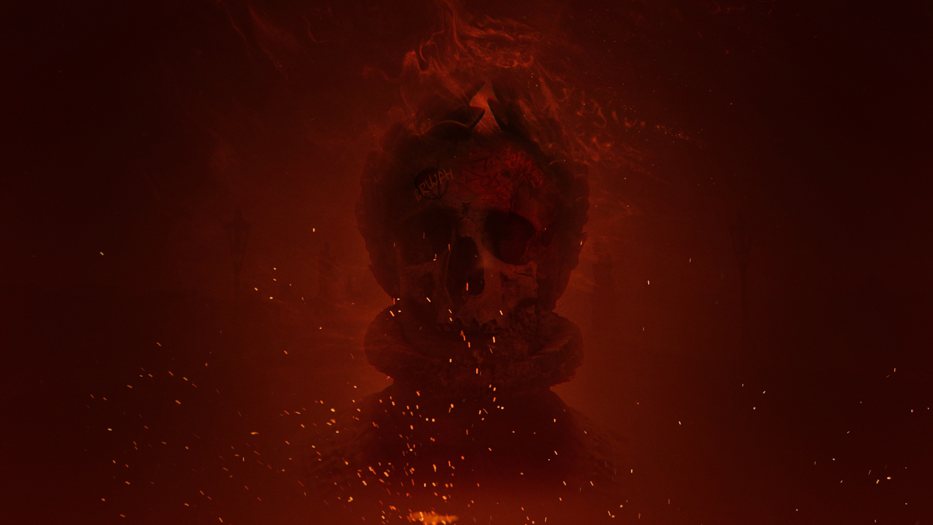
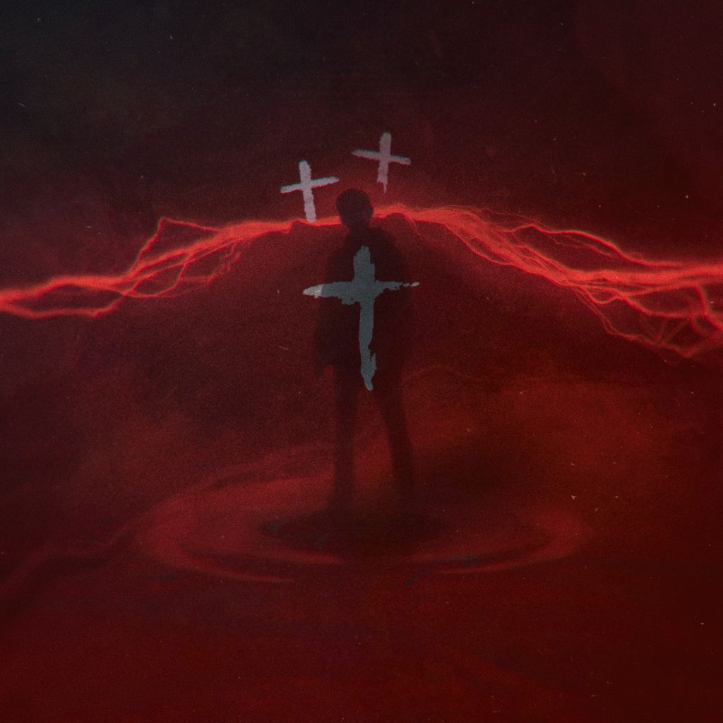
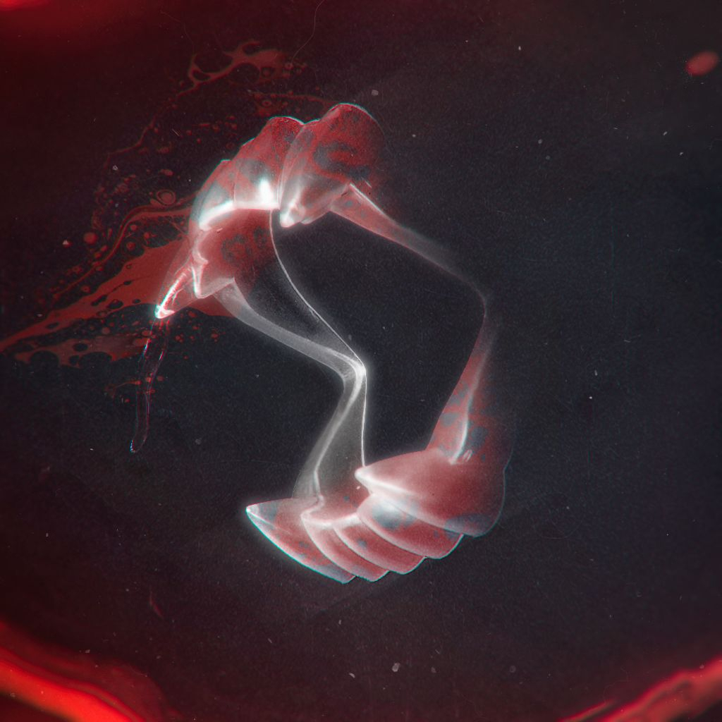
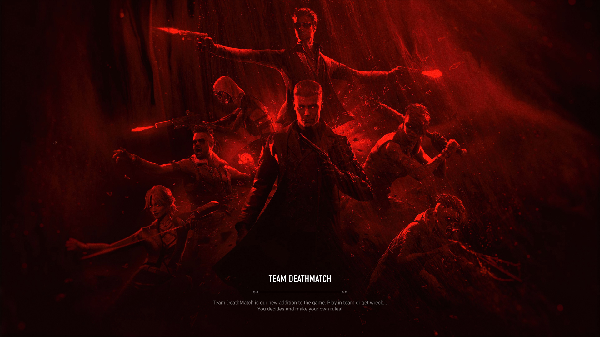
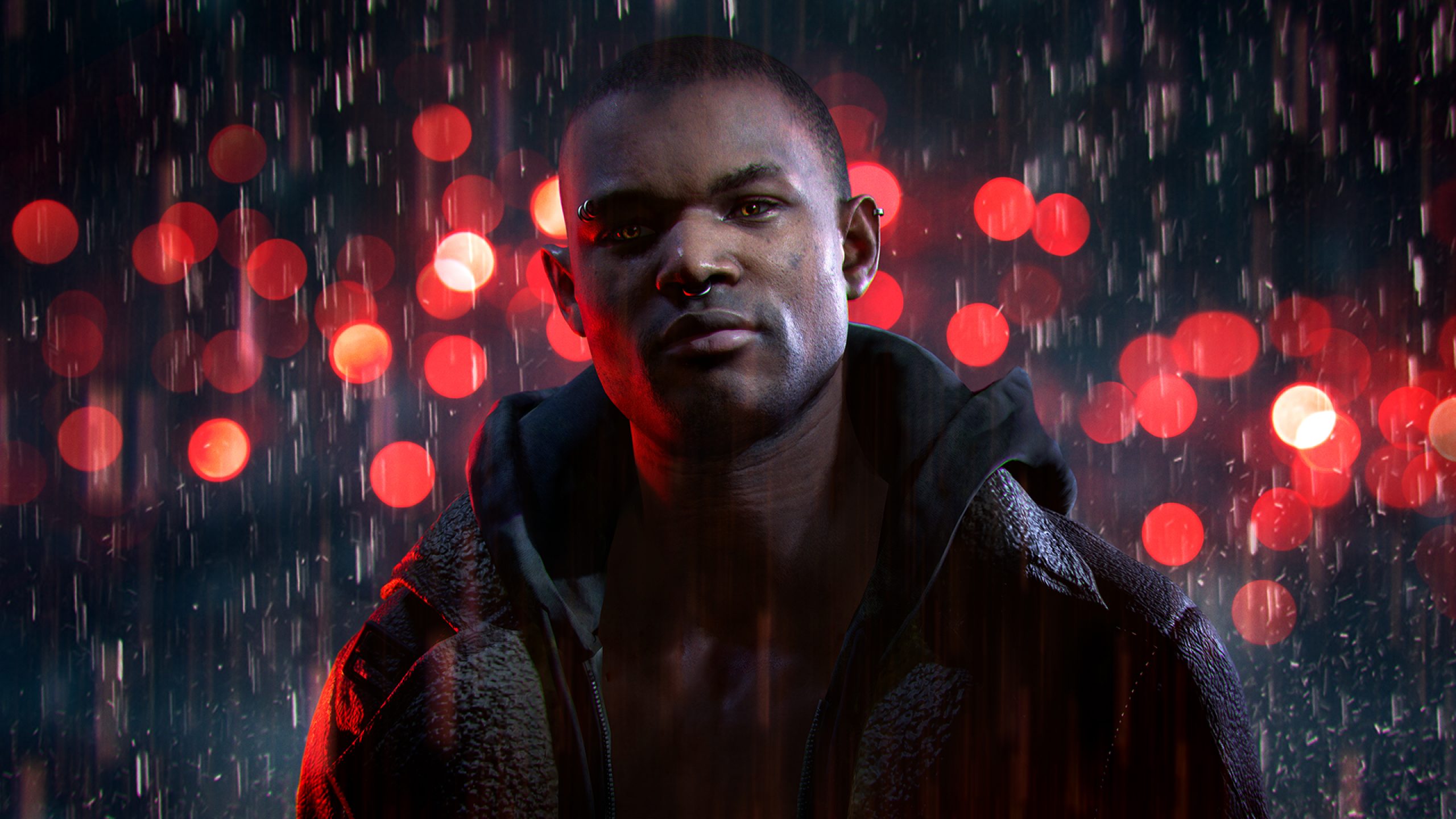
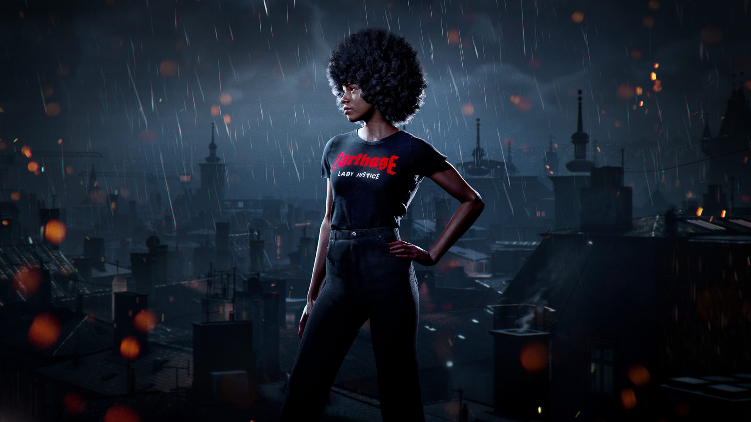
01 — Concept arts
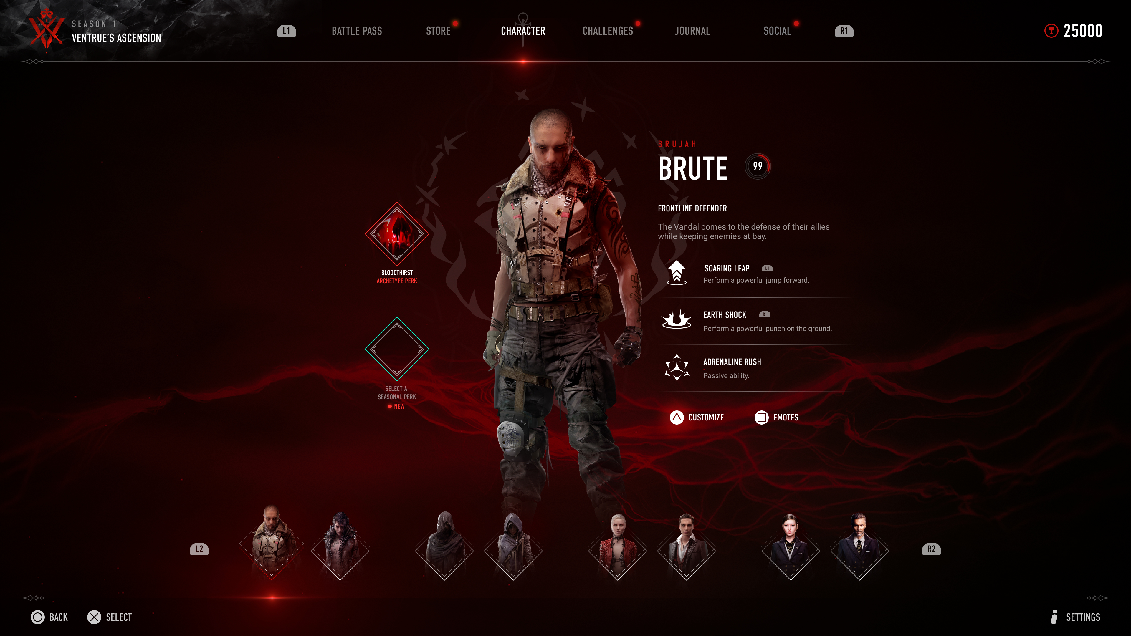
The UI
The UI
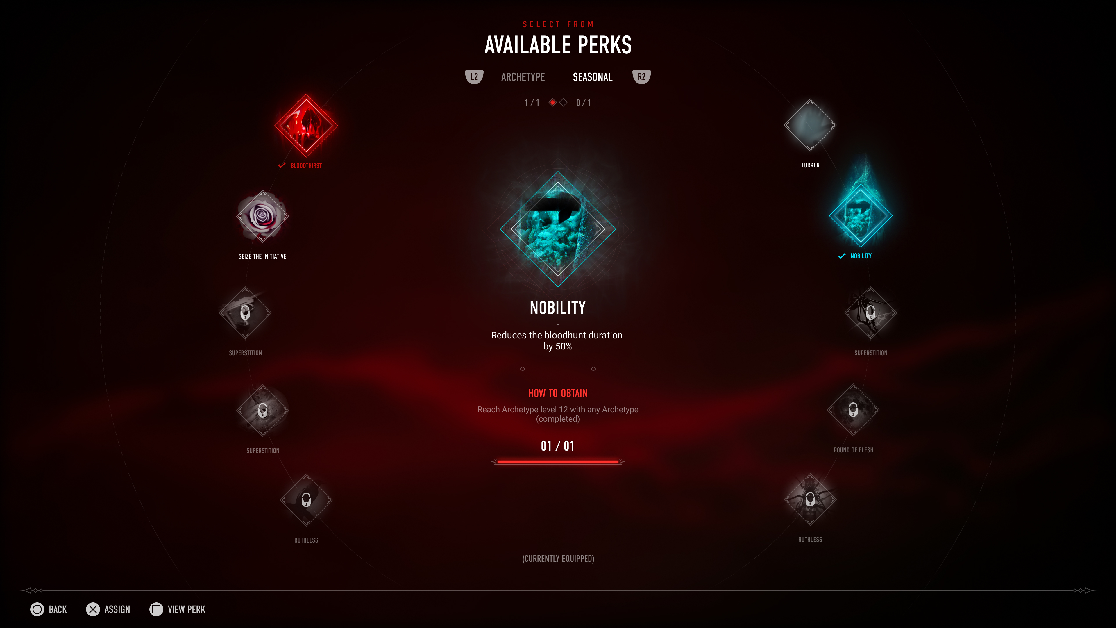
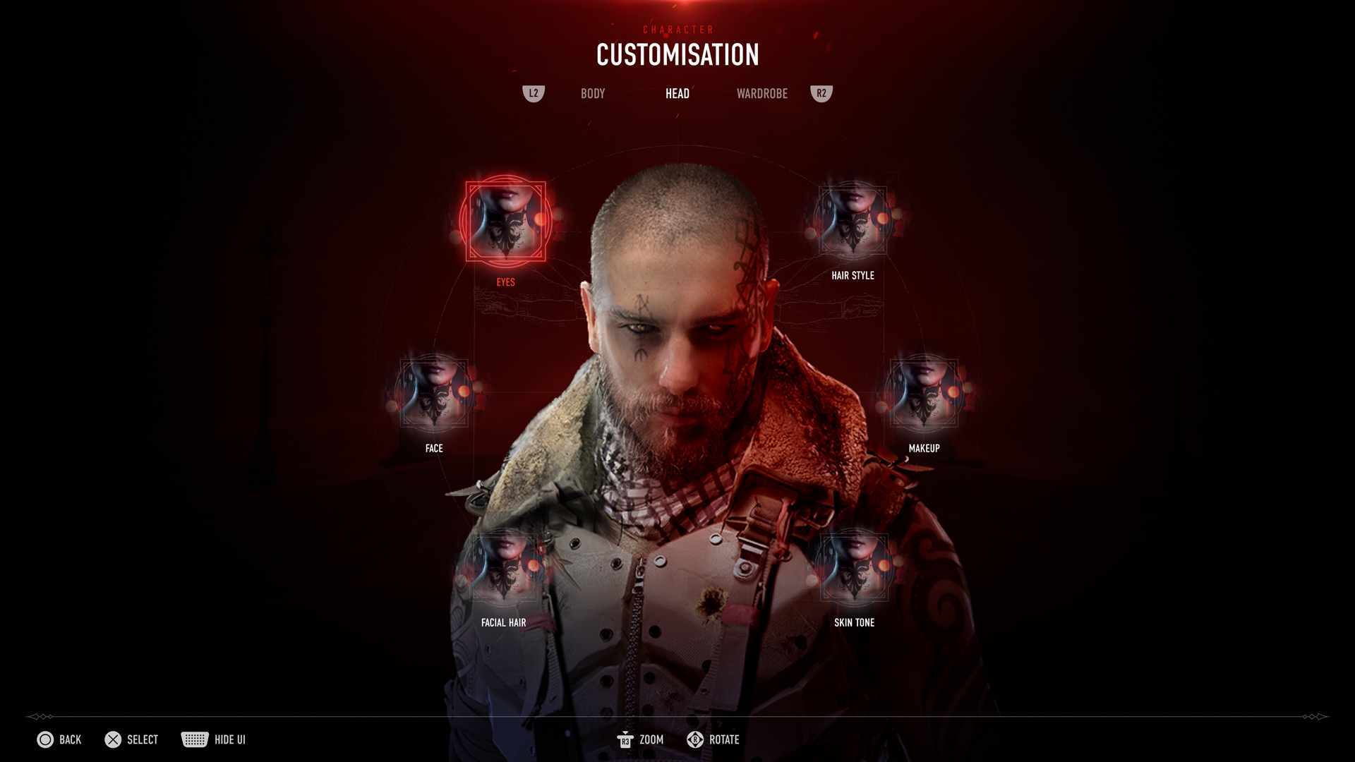
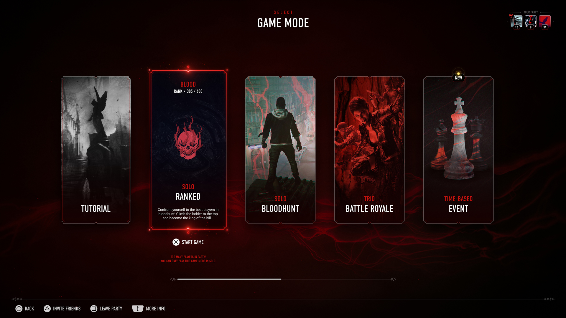
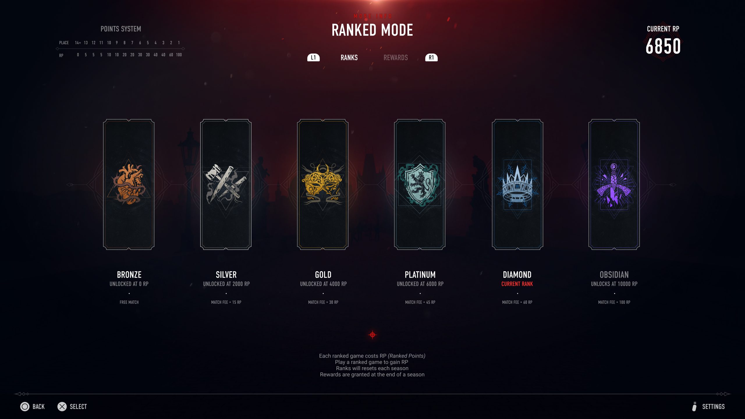
We were grateful to have a well established visual identity for Vampire the Masquarade, but we also wanted to propose a revisited version of it to make it unique to our game. A modern and minimal take on Vampiric/Gothic symbols, composed of thin lines and ornaments, to create a clean and minimal UI.
We wanted the red colour and the veins to be the "red thread" (as we say in Sweden) of the UI. We tried to keep it as minimalistic as possible for our various components while using the red as our accent / active selection color.
When I started working on the UI, I quickly came to realize that, like in any digital product, there are patterns which players are familiar and comfortable with. Patterns which are resulting from the different input methods available (Keyboard & Controller). Thus, I first focused on understanding the reasoning and logic behind such patterns, so that I could decide accordingly when it is appropriate to be creative and improve them or when we should stick with established patterns.
Later on, together with the UX designers, we decided to focus on a console first approach, as it would be easier to scale it to PC. We made sure to evaluate the accessibility levels of our UI to make sure it was at least matching AA standards on each screens. Finally, we also tested our designs regularly on different screens and resolution to make sure it was scaling properly.
A modern and minimal take on Vampiric/Gothic symbols, composed of thin lines and ornaments, to create a clean and minimal UI.
We wanted the red colour and the veins to be the "red thread" (as we say in Sweden) of the UI. We tried to keep it as minimalistic as possible for our various components while using the red as our accent / active selection color.
When I started to design the UI, I quickly came to realize that, like in any digital product, there are patterns which players are familiar and comfortable with. Patterns which are resulting from the different input methods available (Keyboard & Controller). Thus, I first focused on understanding the reasoning and logic behind such patterns, so that I could decide accordingly when it is appropriate to be creative and improve them or when we should stick with established patterns.
Iconography VS illustration
Keeping engaged yet relaxing
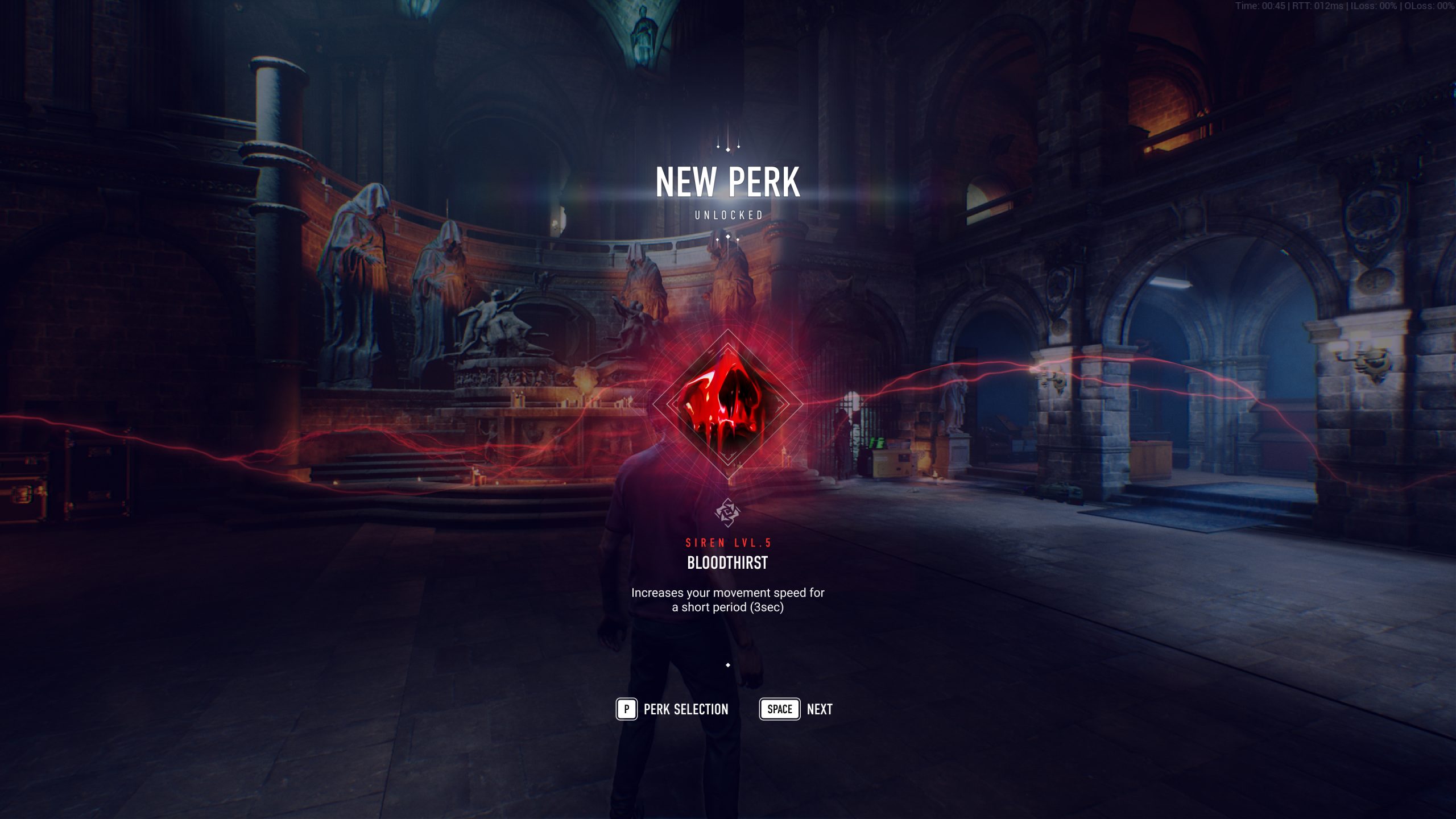
I was also tasked to create quite a few of the icons for the game.
Iconography in game is something else than in traditional product design. Somewhat a lot more fun, as it can be closer to illustration, but also more complex, as we sometimes need to create icons for unconventional features or interactions.
In video games, I have felt even stronger the need to imagine your UI in motion. If you don't your UI will feel stale and will cause a lot of accessibility issues.
For each feature, I have thus developped a Figma prototype or a motion concept with After effects if it required more advanced VFX / interactions so that we would be sure it validating our accpetance criterias and understandble by our players.
Creating usability with motion
Keeping engaged yet relaxing
In games, I strongly felt the necessity to always imagine the UI in motion. Much more than in classic product design.
If you don't, your UI will feel stale and will very much likely leads to a lot of accessibility issues (i.e: various states, transitions...). As a motion enthusiast, I also believe it adds this extra flare players like and which elevate your game standard.
For each feature I worked on, I developped a Figma prototype or a motion concept with After effects - if it required more advanced VFX / interactions - so that we would make sure we met our acceptance criterias and that it is clear for our players what is expected from them. I always try to get out an early prototype as it always is a great way to test your user journey and quickly apprehend most issues with navigation or controls.
It also helped us communicating our work to game directors and developers and validate our assumptions early enough so we could pivot if necessary.
It was a lot of fun to think about how we could re-create effects or motion in the game engine and how it impacted our design work. For example, it was really interesting to play with depth (or giving the illusion of it thanks to blur) in order to create interesting transitions and feedback.
In video games, I have felt even stronger the need to imagine your UI in motion. If you don't your UI will feel stale and will cause a lot of accessibility issues.
For each feature, I have thus developped a Figma prototype or a motion concept with After effects if it required more advanced VFX / interactions so that we would be sure it validating our accpetance criterias and understandble by our players.
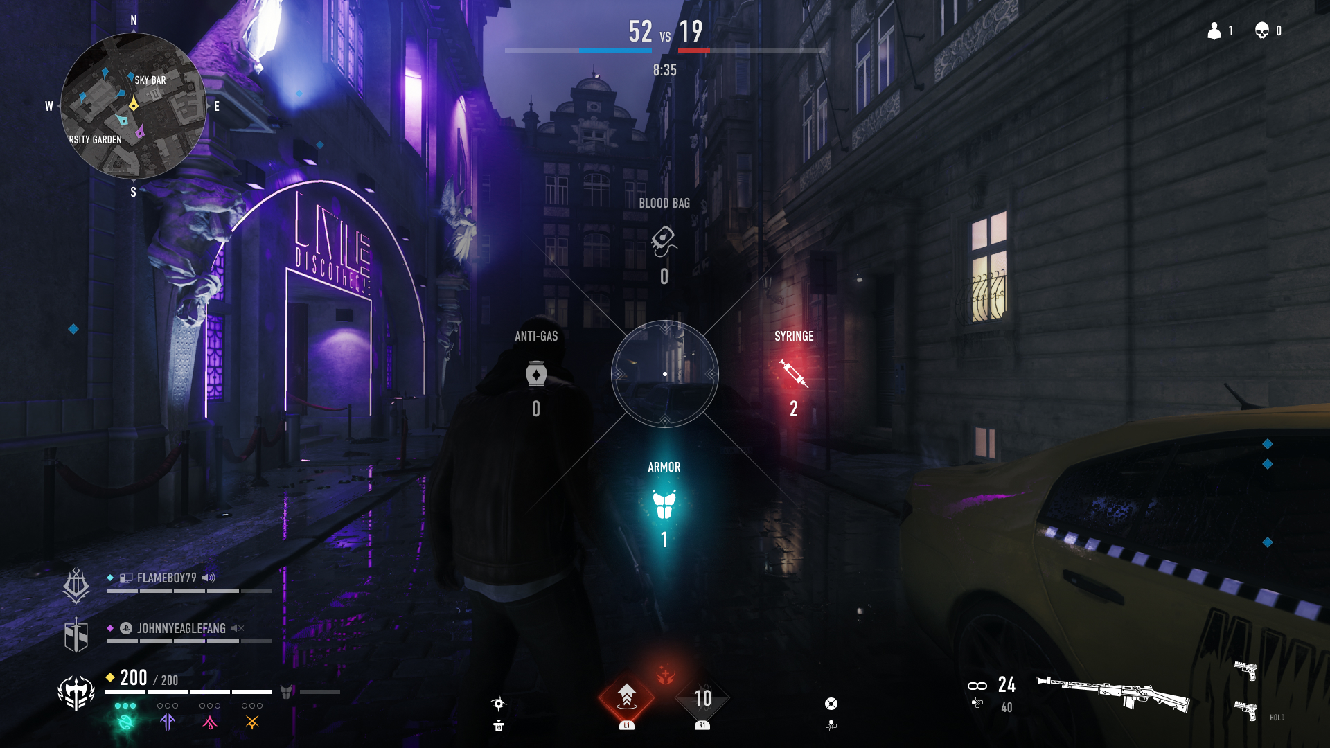
Below some of the final concepts made to illustrate and validate the players journey from queuing to joining a game.
• In game HUD shortcut to queue for a game.
• Character selection screen from "Match found" to the "Battlefield".
02 — Game queue HUD
03 — Character selection
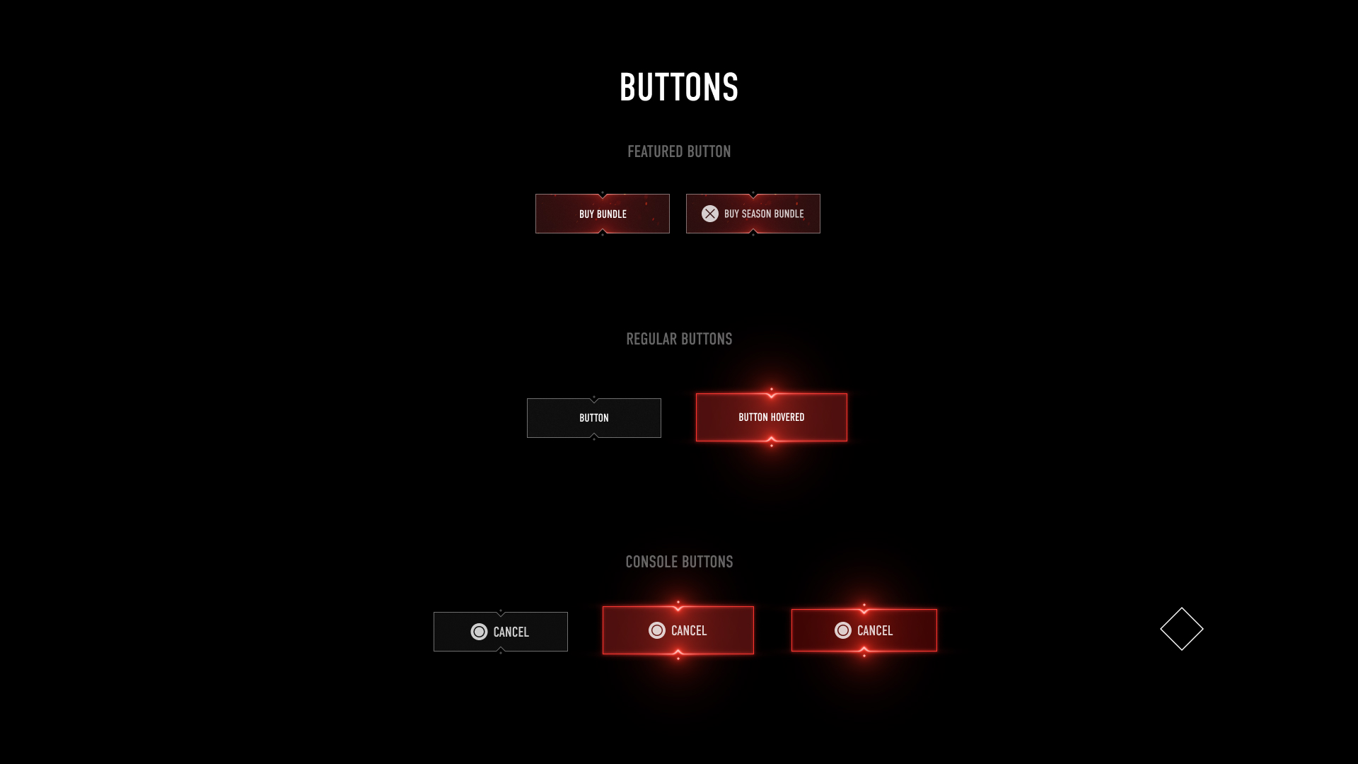
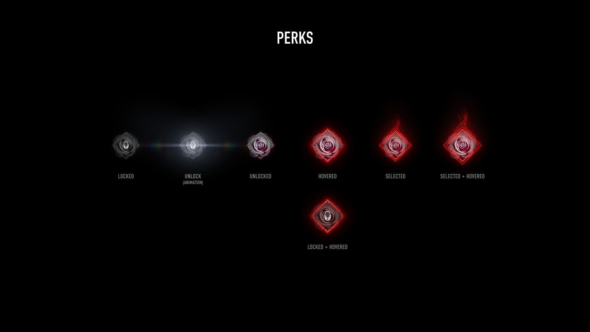
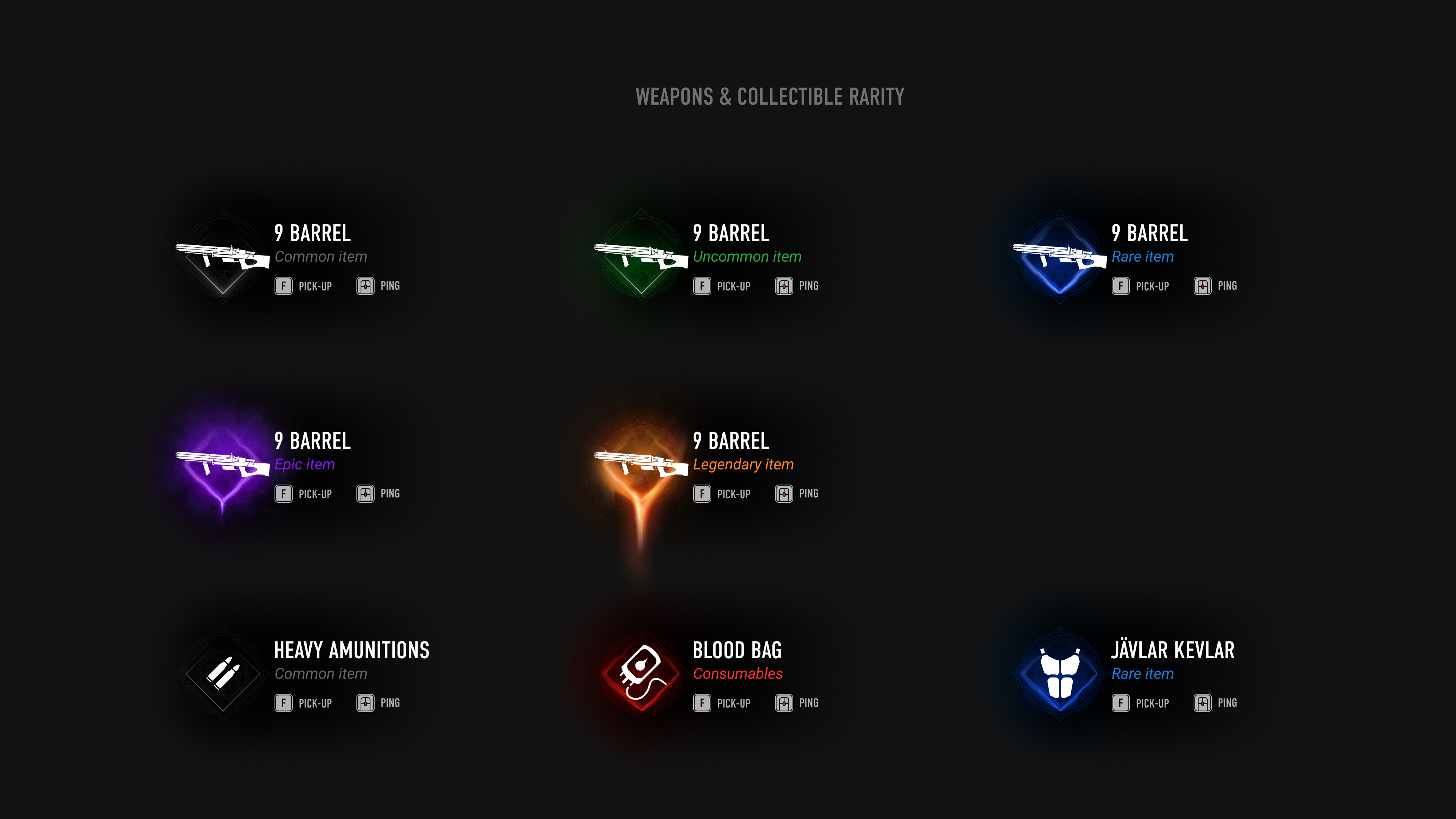
Buttons and interactive component states & behaviours
Keeping engaged yet relaxing
As we are not designing for touch screen, I had to pay an extra attention to the various buttons states needed, to avoid any unecessary confusion, while remaining consitent with other elements and states in the UI (What's glow for? What's "Bloody"? etc.). It was a quite complex but great exercise. In the end, we decided to use glow for hovered states, and kept the veins to emphasis your selection.
By documenting our intentions, we could easily share it with the devs and keep consistency when building new components.
All in VFX :)
Keeping engaged yet relaxing
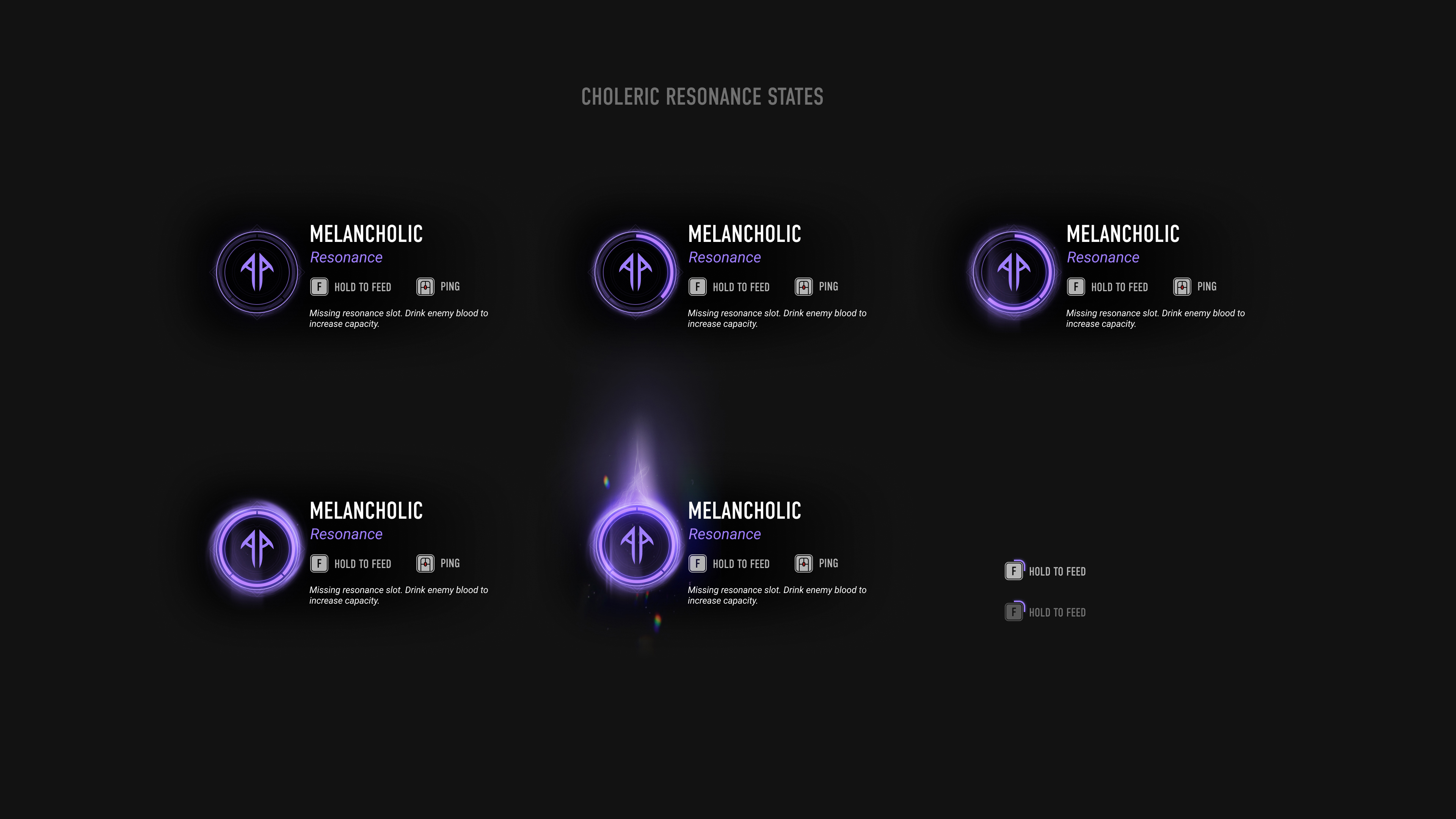
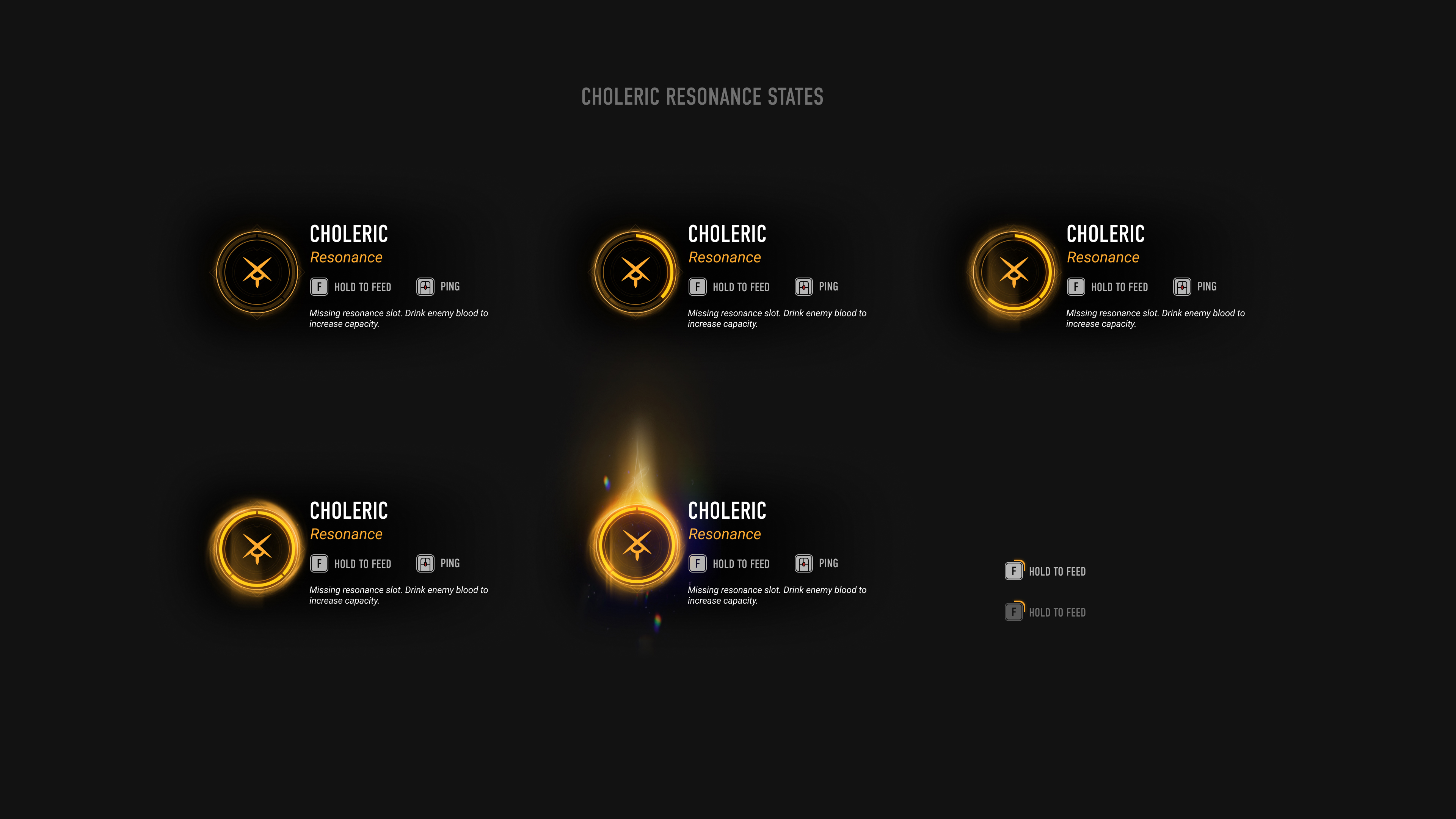
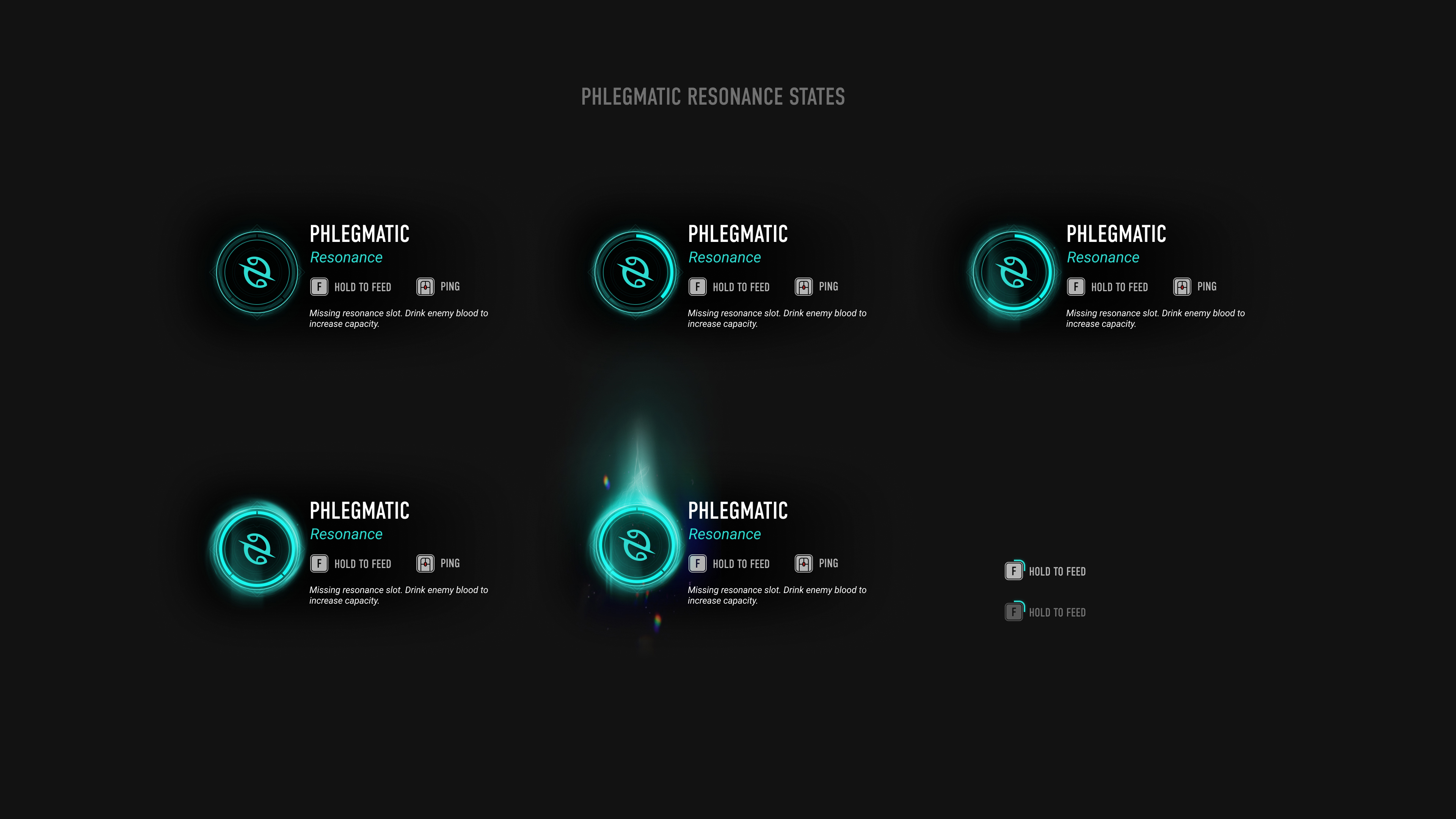
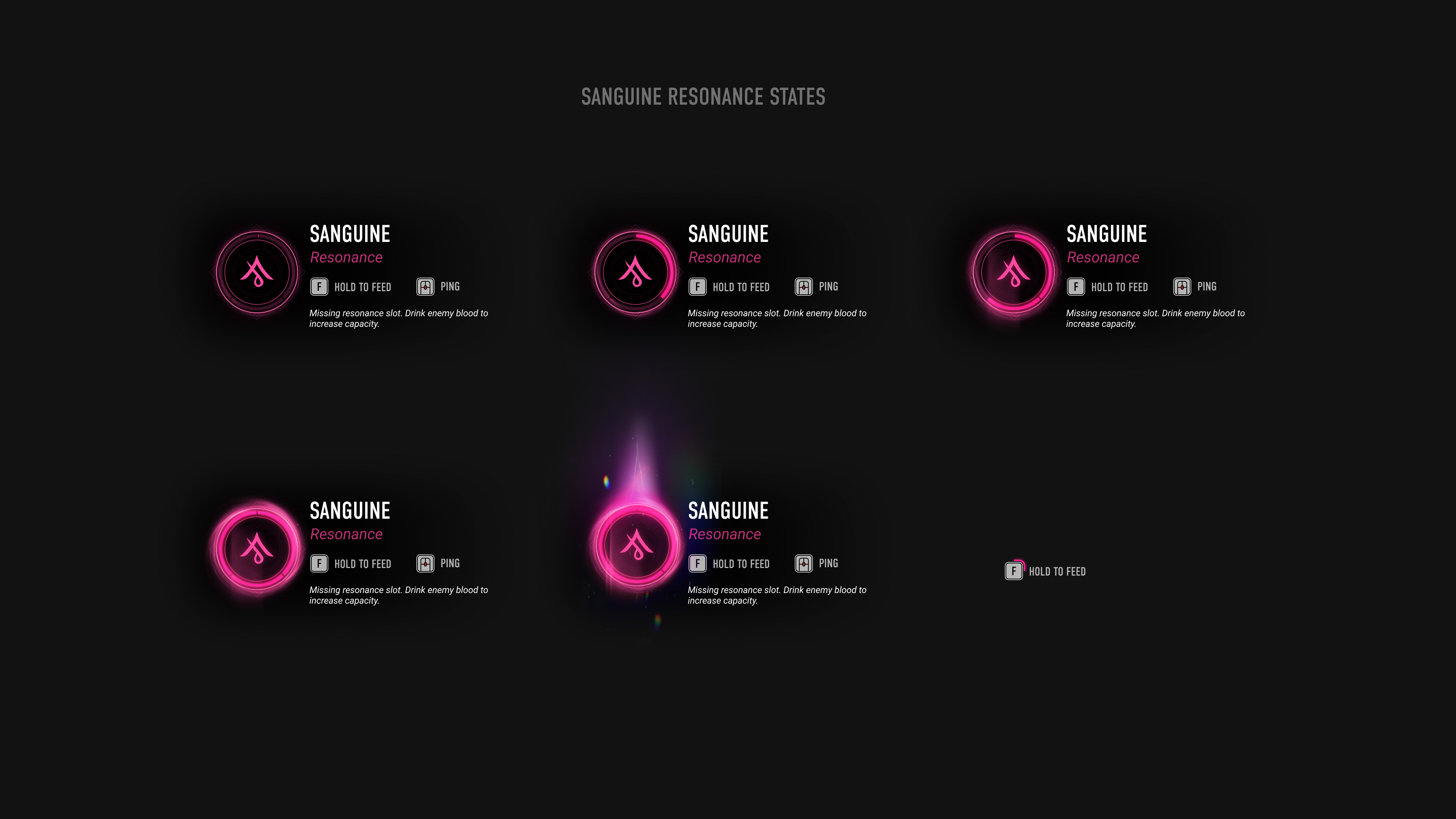
VFX - as well as motion - is of tremendous help in games and UI, when you need to convey an idea or even to notify players. Even if caught by the corner of an eye.
Below is some VFX I did for the resonnances (additional powers) incremental system, first in AE then built in Unreal.
For these ones, we took an extra care about accessibility regarding the colors and we made sure that they would be quite different from each others for our visually impaired players.
Bonus
Bonus section with various animated screen made for the game, design system snapshot, prototypes...
Thirsty for more?
↳ to projects