ALPHAGUIDE
ALPHAGUIDE
ALPHA-GUIDE
Alphabet is part of BMW Group, and focuses on mobility services along with the leasing experience for companies employees.
We helped them defining their mobility strategy, build their product and brand.
Alphabet is part of BMW Group, and focuses on mobility services along with the leasing experience. We helped them defining their mobility strategy, build their product and brand.
Alphabet is part of BMW Group, and focuses on mobility services along with the leasing experience.
We helped them defining their mobility strategy, build their product and brand.
COMPLETED•Oct. 2018 - Current
ROLES•Lead designer
PLATFORMS•IOS / Android
CONTEXT•Ustwo x Alphabet (BMW)
TIME FRAME•Oct. 2018 - Sept. 2019
ROLES•Lead visual designer
PLATFORMS•IOS / Android
CLIENT•Alphabet (BMW)
COMPLETED•Oct. 2018 - Current
ROLES•Lead designer
PLATFORMS•IOS / Android
CONTEXT•Ustwo x Alphabet (BMW)
Overview
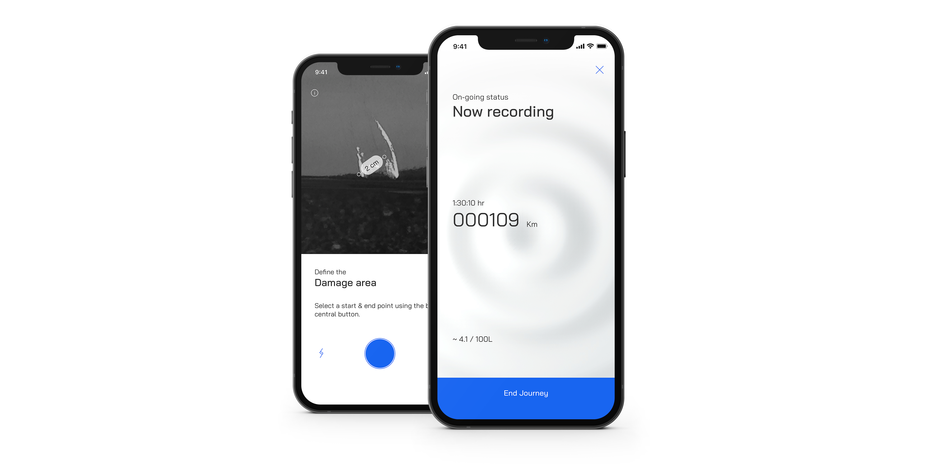
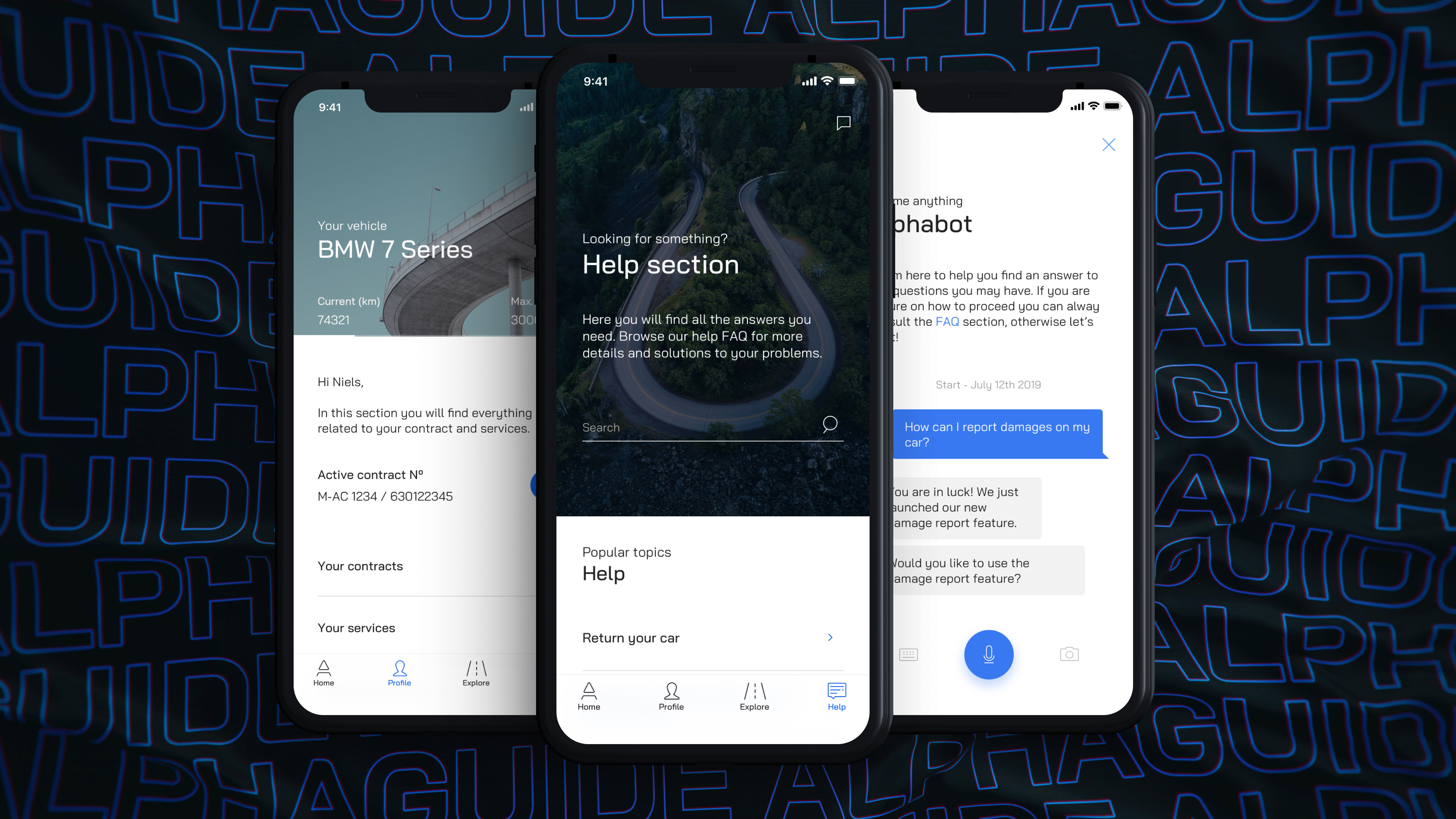
AlphaGuide isn't a classic car leasing application but rather a companion app for long rental period drivers (2-4y).
Here, no car booking system, but rather a collection of features that help drivers with their journeys (mileage tracker, contract information, roadside assistance, claim management, damage report, etc...).
It's an international application - 13 markets - with as many languages and regulation to support. 
The process •
Reboot workshop → Ideation sessions → Desk research → Emphaty map → Tech spike & sync → First sketches → Architecture flow & wireframe → Prototyping & testing → Iteration → Visual design & motion assets → Documentation & Design system → Design QA
Workshop (1/3) • Re-Branding & V.2.0
When I joined the team - late 2018 - Alphabet already had a product out for a few years which, in my opinion, wasn't up to par with the group image and ambitions.
My mission & personal challenge revolved around making a gigantic group like Alphabet BMW realize the urge to pivot and redefine their product strategy & brand identity, in order to catch up with the competition. Quite the daunting task ;)
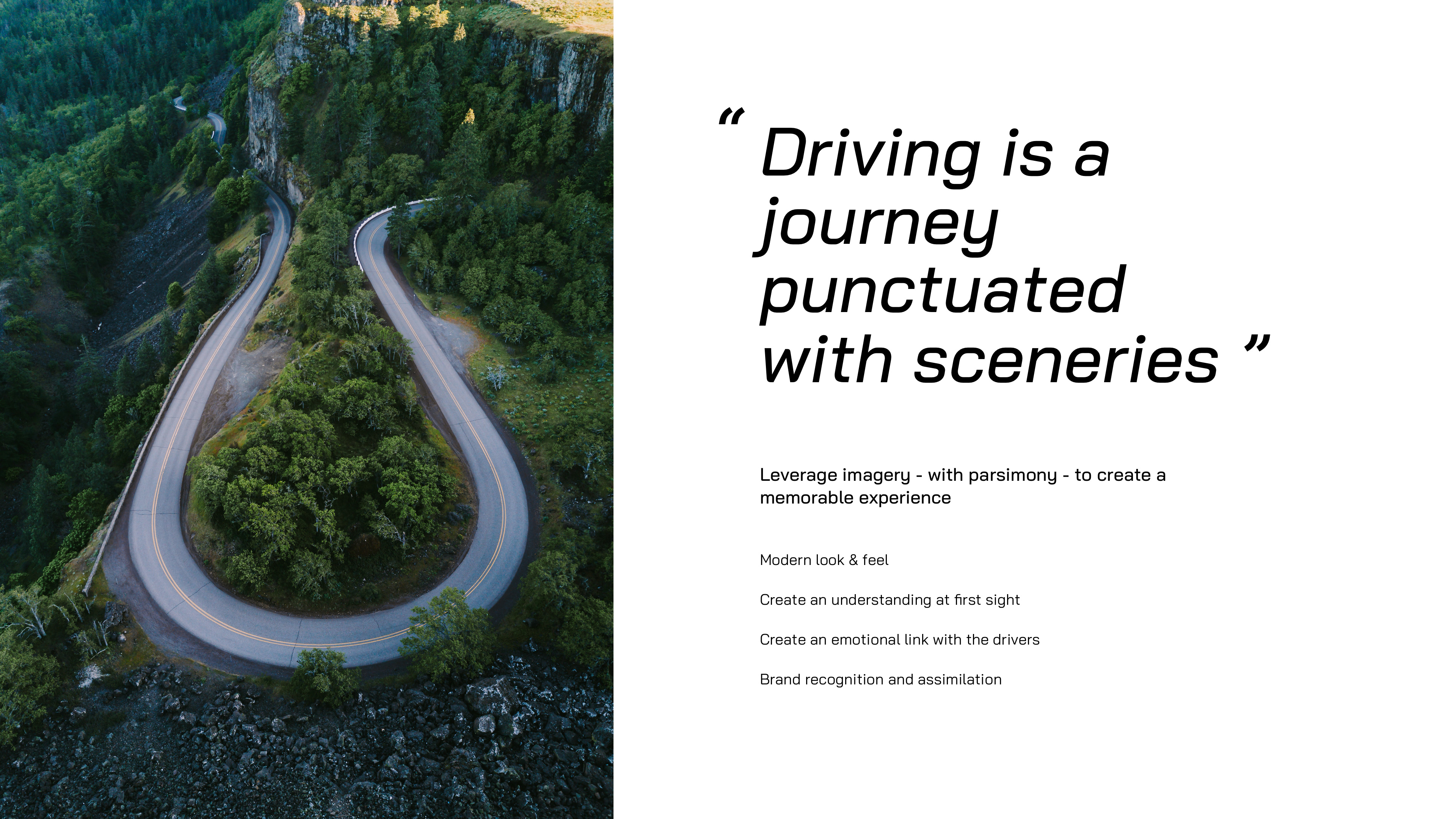
As a starting point, and as a small warm up of the kickoff workshop, we encouraged them to go through a rebranding exercice, which would take them back to their roots and define their "essence of driving".
Together, we reflected on what is mobility about? What is the core of driving? What makes driving memorable?
On a very basic level, "Driving is a journey punctuated with sceneries & memories". To get this vision right, it was important to leverage imagery - with parsimony - to create a memorable experience. While driving, you create memories through landscapes and landmarks (“I remember - when we went on a trip - seeing...”) and you can get emotionally involved (“I like going through here because it’s nicer”). It came up as an evidence to link the brand and our product to those emotions.
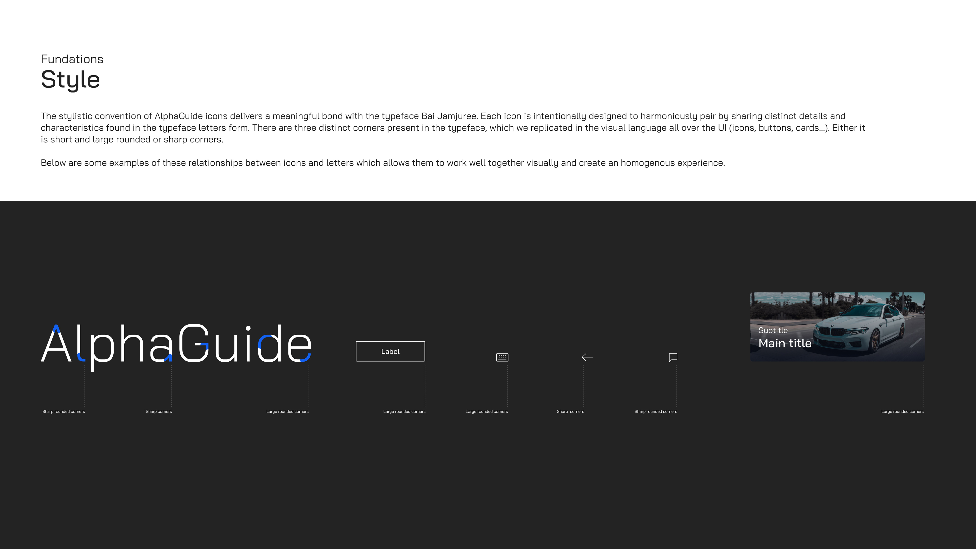
"Driving is also about being in motion" and Motion design is a core element of todays’ UI, as it helps users understanding better interaction patterns and required actions.
Finally, driving is about being "efficient" at providing information clearly. Thus, we made sure to keep information in focus along with providing a clean and mordern look to the content, creating a set of components, easily accessible and straight to the point.
Overview
AlphaGuide isn't a classic car leasing application but rather a companion app for long rental period drivers (2-4y). Here no car booking system, but rather a collection of features that help drivers with their journeys (mileage tracker, contract information, claim management...).
It's an international application - 13 markets - with as many languages and regulation to support.
The process •
Reboot workshop → Ideation sessions → Desk research → Emphaty map → Tech spike & sync → First sketches → Architecture flow & wireframe → Prototyping & testing → Iteration → Visual design & motion assets → Documentation & Design system → Design QA
Re-Branding & 2.0
When I joined the team - late 2018 - Alphabet already had a product out for a few years which, in my opinion, wasn't up to par with the group image and ambitions.
My mission & personal challenge revolved around making an gigantic group like Alphabet realize the urge to pivot and redefine their strategy & brand, in order to catch up with the competition. Quite the daunting task ;)
As a starting point, we encouraged them to go through a rebranding exercice which would take them back to their roots and define their "essence of driving".
We reflected on what is mobility about? What is the core of driving? What makes driving memorable?
On a very basic level, "Driving is a journey punctuated with sceneries & memories". To get this vision right, it was important to leverage imagery - with parsimony - to create a memorable experience. While driving, you create memories through landscapes and landmarks (“I remember - when we went on a trip - seeing...”) and you can get emotionally involved (“I like going through here because it’s nicer”). It came up as an evidence to link the brand and our product to those emotions.
"Driving is also about being in motion" and Motion design is a core element of todays’ UI, as it helps users understanding better interaction patterns and required actions.
Finally, driving is about being "efficient" at providing information clearly. Thus, we made sure to keep information in focus along with providing a clean and mordern look to the content, creating a set of components, easily accessible and straight to the point.
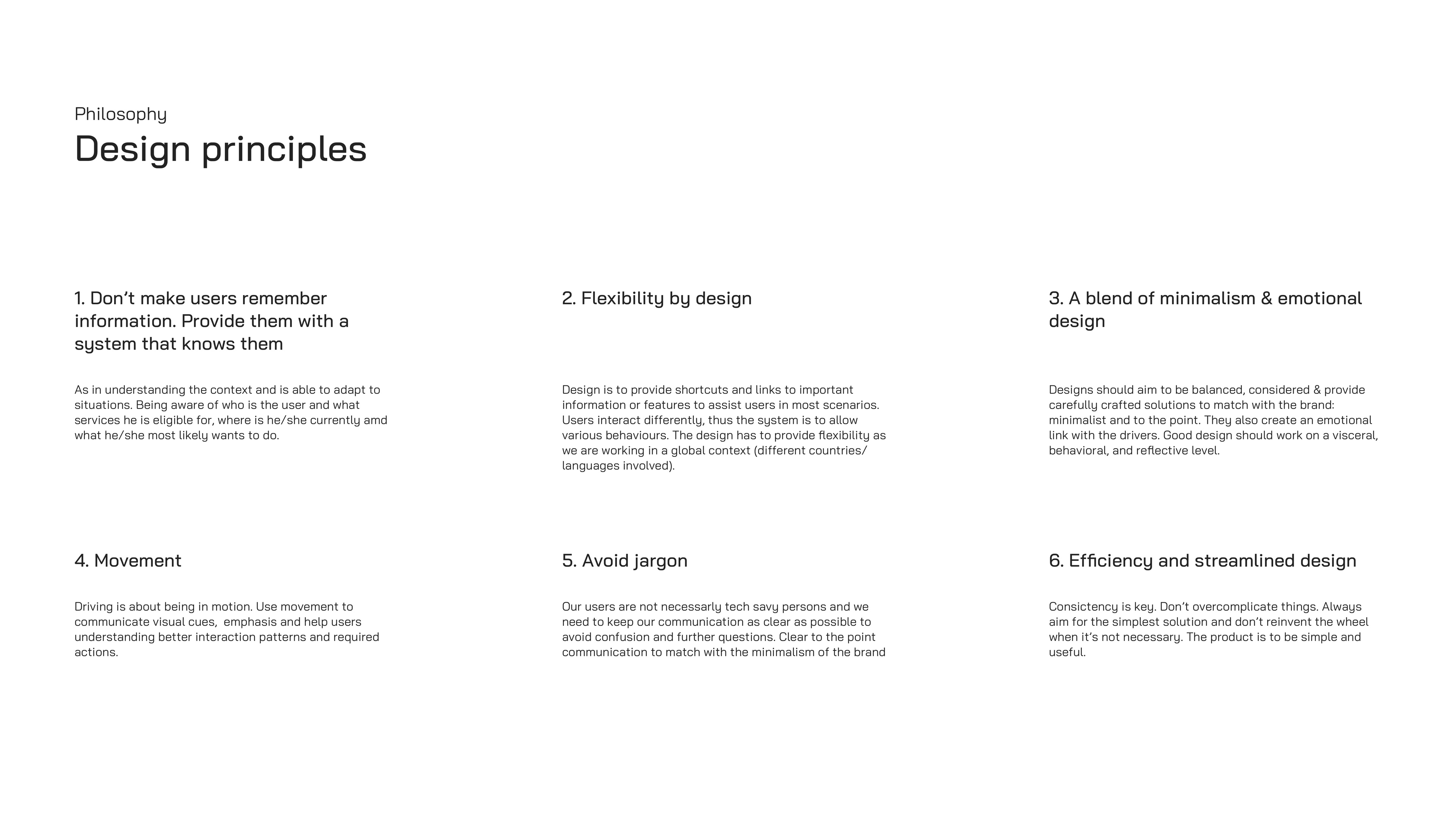
Design Principles refresh
I believe a re-branding should automatically involve a refresh of the design principles to make sure you convey the right idea to client. You want to make sure we speak the same language and have the same vision for the product we are co-creating or refreshing.
Design Principles refresh
I believe a re-branding should automatically involve a refresh of the design principles to make sure you convey the right idea to client. You want to make sure we speak the same language and have the same vision for the product we are co-creating or refreshing.
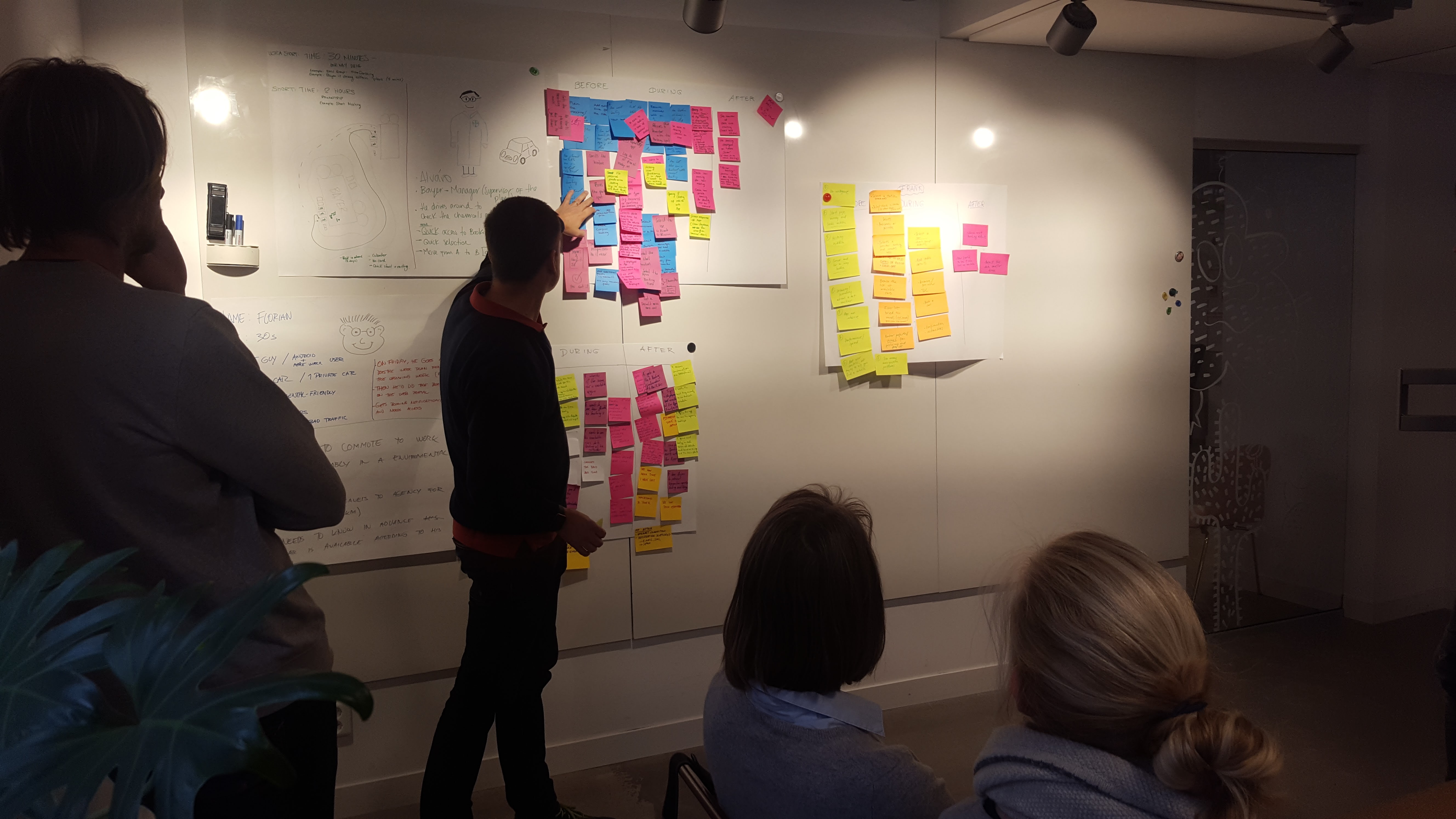
Workshop (2/3) • Target audience & Personas
Design system
Then, we asked the client to go through a quick personas definition exercice, to make sure our original personas were still relevant years later. Pleasant surprise, they were still pretty accurate and didn't feel the need to revisit it deeper.
Then, we asked the client to go through a quick personas definition exercice, to make sure our original personas were still relevant years later. Pleasant surprise, they were still pretty accurate and didn't feel the need to revisit it deeper.
Workshop (3/3) • North Star
Design system
It was also important to revisit our objectives for the product and see if we needed to define a new vision.
One of the major and obvious painpoint was that the product already had a consequent amount of features but all where quite mechanical.
It was trying to solve everything instead of focusing on delivering the "best in class leasing journey experience" and providing tailored services to the drivers.
The Basics •
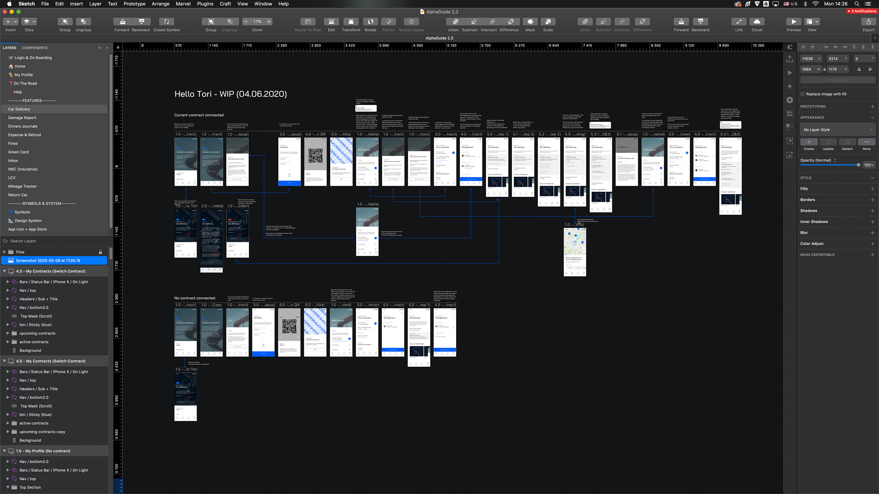
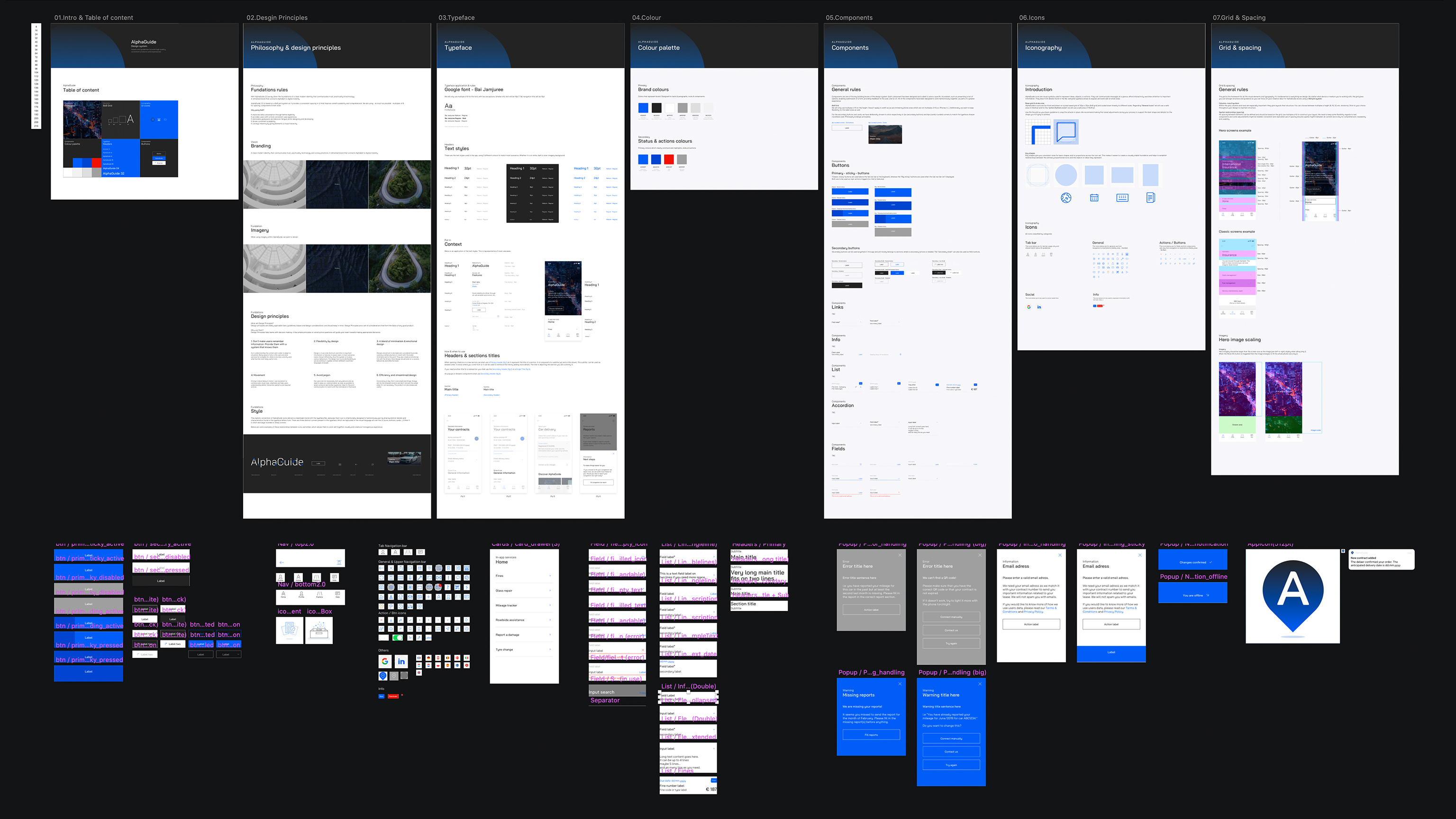
Audit - Organic Design system & System architecture
Design system
In parallel, we conducted an audit of their current application which revealed many inconsistencies and flaws that we would start addressing first, before going deeper in creating more features.
Not only we found many inconsistencies or redunduancies but also discovered that AlphaGuide shelters 2 other applications that we ultimately would like to split for a better user experience. Thus, we started to emphasize the importance of owning a proper design system to ensure consistency and help their teams. It would also provide them with a more structured and guided way, to build solutions for their products’ problems in the future.
We built the first iteration and underlined the importance of evolving it, as a design system is an organic piece.
First sketches •
A smarter & smoother experience a.k.a The Core
Design system
Based on the workshop, our audit and user tests findings, it was time to go back to the drawing table and start sketching.
First, we decided to focus - for this redesign - on making the whole experience tailored made to drivers, rather than trying to come up with even more
features or refine them yet. We wanted each single user to feel that this app, was covering their needs on a specific journey, event or occasion.
Additionally, we wished to create a fast action / fast results application, as when you are on a journey, you don't necessarily want to spend much time
or efforts in planning your day or even spend hours doing administrative tasks related to your trips.
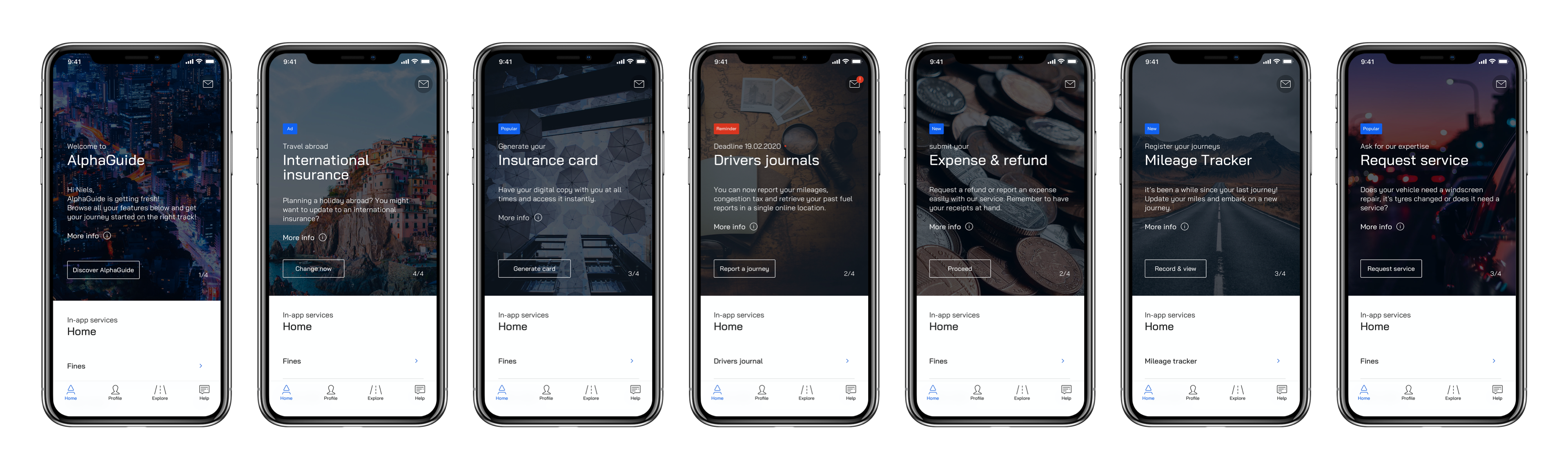
To do so, we came up with a "contextual feature system" proposing drivers with up to 4 actions/features which are relevant to take action on this day,
week, month.
This smart home system is linked to drivers' contract and services to ensure we provide them with relevant services.
We can imagine that a driver have an annual vehicle checkup to plan or a renewal of insurrance coming up for instance. He or she, will then be prompt
directly on the home screen - at the right time - via those "Smart homes" and won't miss any important information.
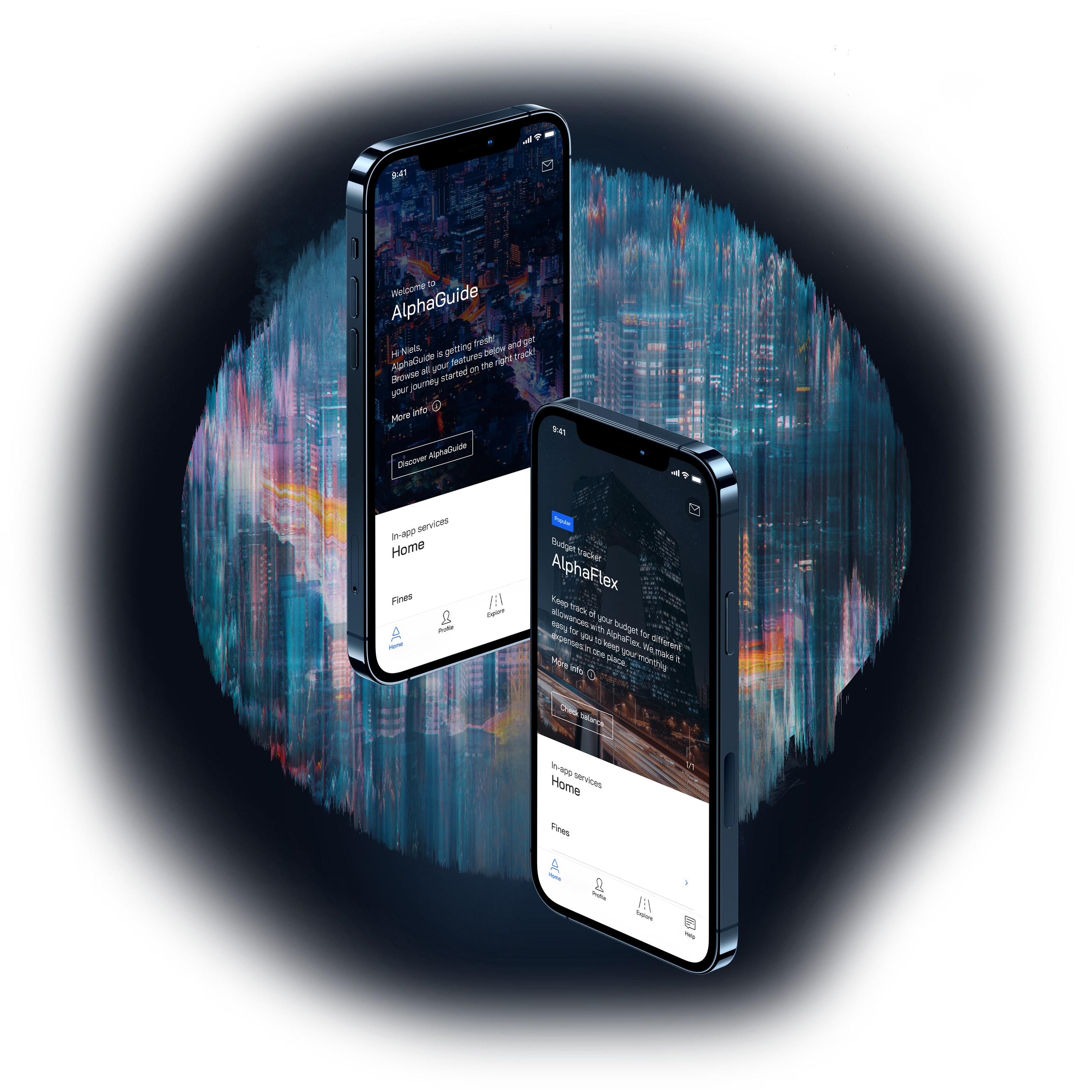
Another big piece of the redesign was the total rework of the navigation bar.
Our goal was to provide users with clear specific areas for the various type of content available in AlphaGuide so that information would be instantly and easily accessible.
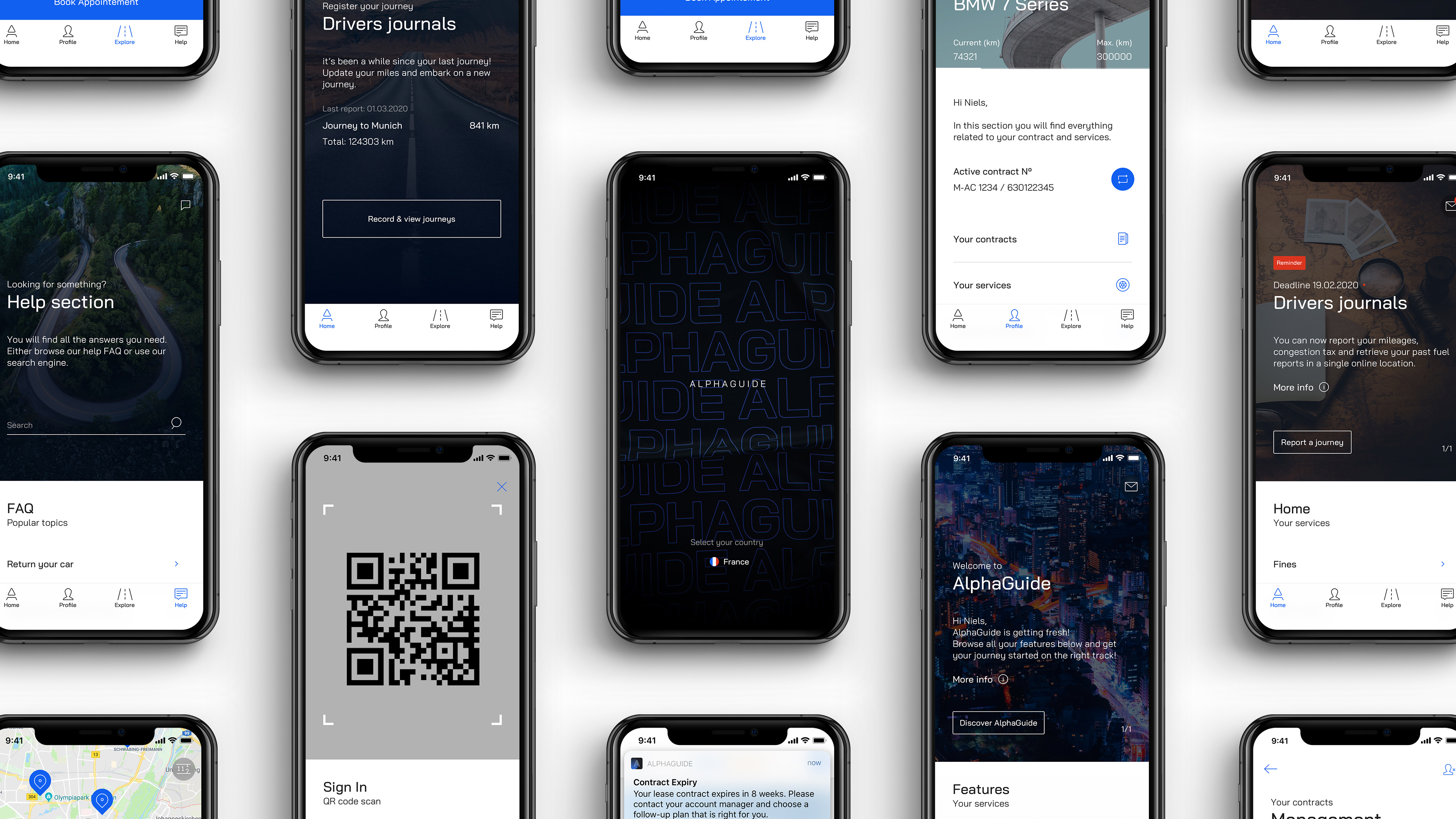
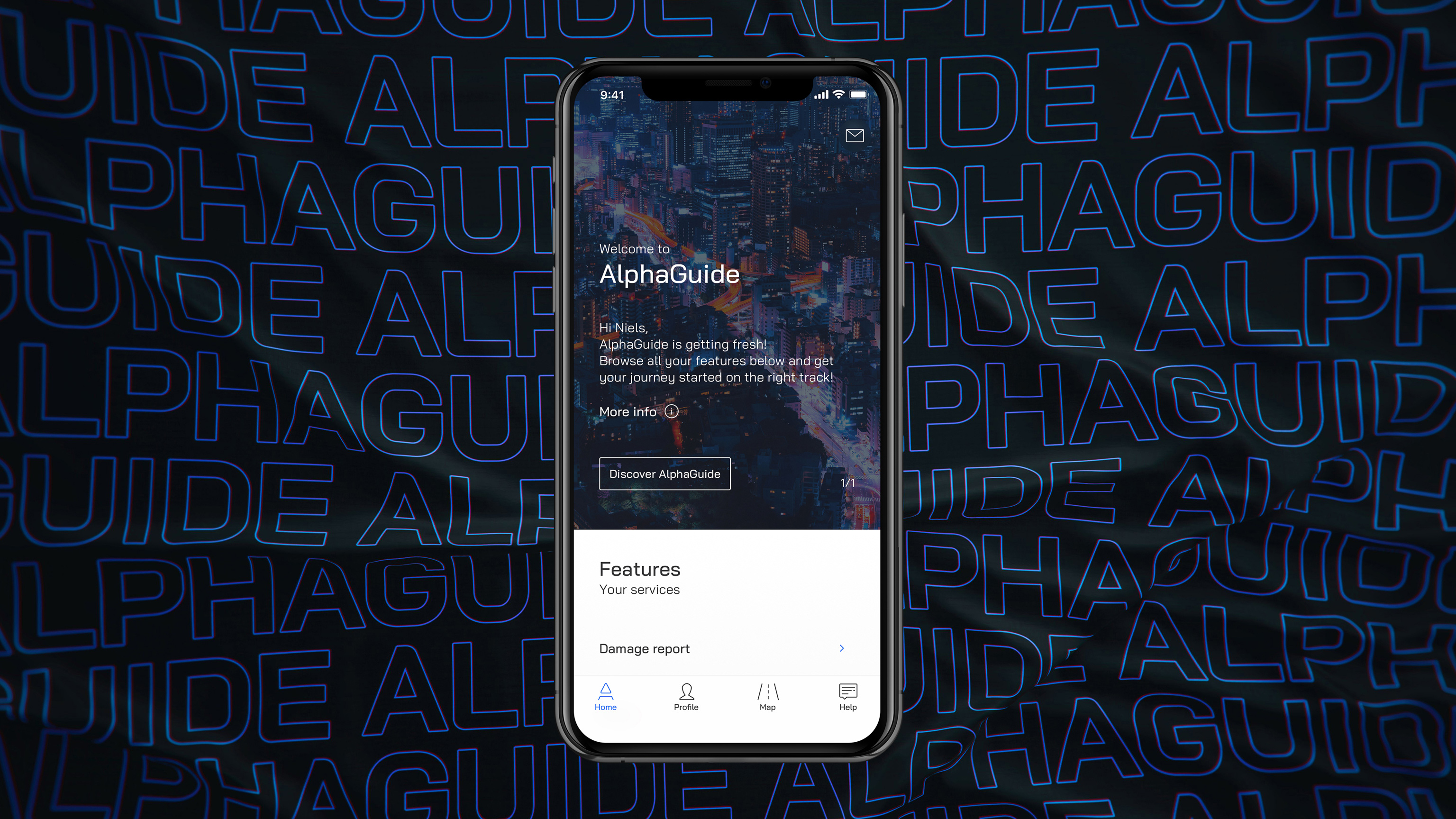
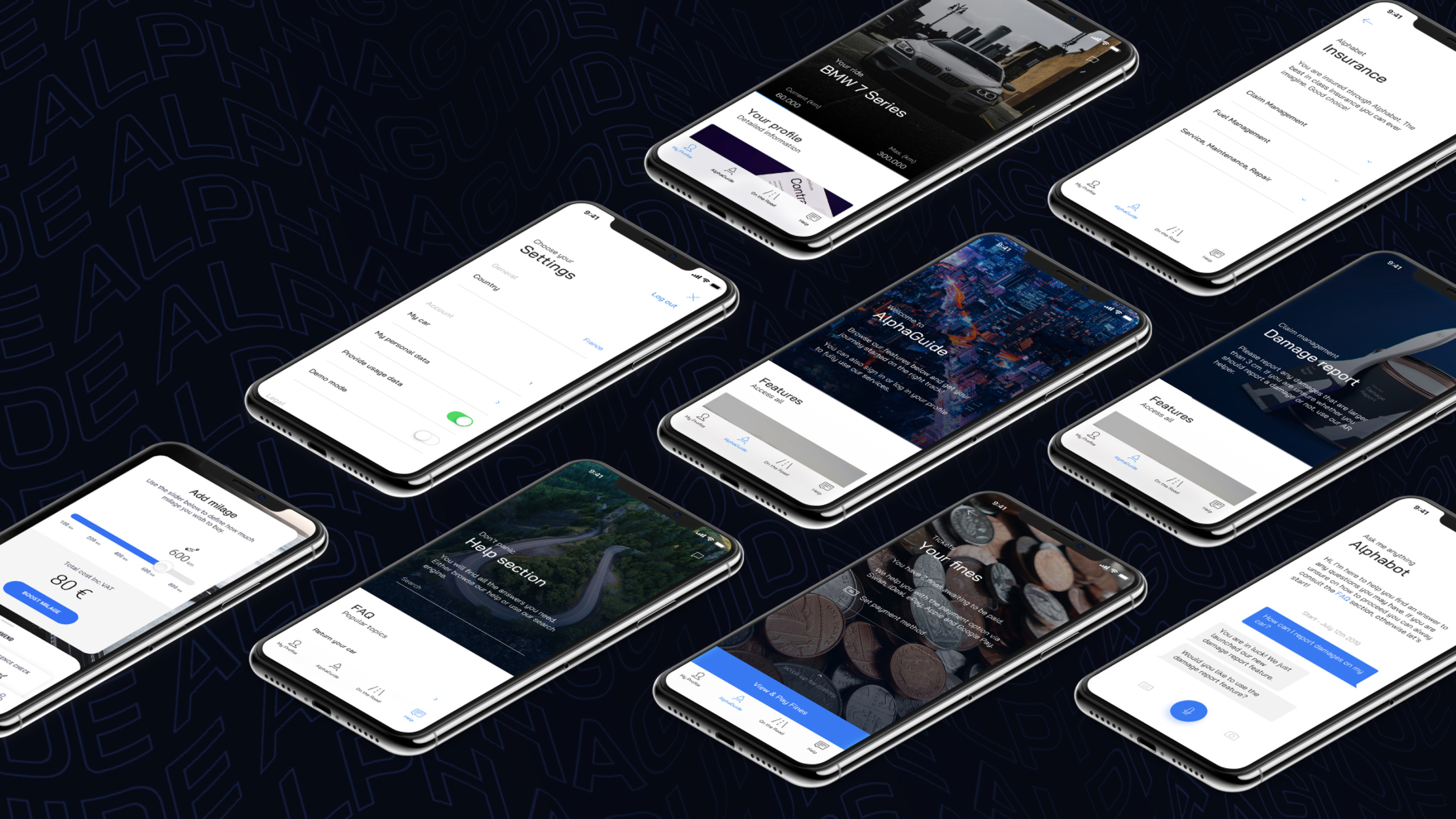
Home
All features in a single location
Enhanced clarity and navigation
Highlight of important features (Contextual features system)
Eligible Feature System™ (e.g contract based features)
Profile
Quick access to my personal info • Services • Data • Mileage • Service card
Clear visualisation of my contract data (e.g current mileage, start/end data…)
Contextual interactions with core features (e.g green card renewal)
Direct contact with Alphabet (e.g chat)
Explore
To guide you to destination and find Points of interest such as partner garages and the likes.
Provide the essential services that connect to your contract
Filtering system according to your car type & contract (Smart data)
Display preferred partners
Help
To provide a single touchpoint to users' questions & contact
Increase drivers’ access to information & knowledge
Contextual interactions with core features (e.g Service appointment booking)
Reduces usage of the hotline
Get in touch with drivers (e.g 2 way communication)
We received many feedback from users, especially around the lack of information available.
On the otherside, one of the major KPI from the client was to reduce hotline costs.
Thus, we decided to give a prominent space to help, create an interactive FAQ and a chatbot for the users to find any information instantly.
Moving on with "Smart" features - Classic agile sprints
Design system
Once the core in place and tested, we moved towards defining the features set. At this point, we adopted a classic agile way of working (2 weeks sprint).
First of, we challenged the status and order of features. Is this or this feature still relevant for AlphaGuide's drivers?
Then, with our new set of features and the new structure in place, we defined how we could make them intelligent and contextual to fit nicely into our drivers' journey.
For each feature re-work, we adopted the following structure:
Feature definition & KPI's → users' expectations mapping (feature level) → Tech spike & sync → First sketches → Architecture flow & wireframe → Visual design & motion assets → Documentation & design system update.
Prototypes & Experiements
All theories are great but in practice, it's always a different story. Prototypes are great tools to convince stackholders that an idea holds.
It was time for us to start testing our work intuitions and assumptions through prototypes, which we shared with a few users and our stackholders.
Below are gathered some experiements, prototypes for user testing or testing interaction patterns which all lead to the current version of the redesign.

hope you enjoyed it
↳ to projects